
Logo vs. brand identity: One Visible Piece of a Much Bigger System
Estimated read time: 6 min
Ask someone to picture your business, and they'll probably picture your logo. That's not a bad thing. It's exactly what a logo is built to do.
A logo is also the easiest thing to mistake for the whole brand, since it's the one piece everyone can see and point to. Most businesses don't stop to think about what a logo is supposed to do. They just know they need one, and that's usually where the process stops.
Mistaking a logo for a brand identity is common. The logo gets noticed, while the identity behind it works without ever getting the credit.
What Makes a Great Logo Work
A logo has one real job: make a business recognizable at a glance. That sounds simple, but it isn't. A logo has to work in a hundred different places, a website header, an invoice, a shirt, a business card left behind on a counter, and still look like the same business every time.
Shape and style carry weight too. A soft, rounded mark reads warmer than a sharp, angular one, and a good logo leans into whichever feeling fits the business behind it. Most brands end up needing more than one version to pull this off, a full logo, a smaller icon, sometimes a single-colour option, each built for a different spot but still carrying that same feeling.
Getting that right takes real skill, and it's worth crediting. What it isn't built to do is carry a business's entire personality on its own.
So What's the Difference Between a Logo and a Brand Identity?
A logo isn't built in a vacuum. It already uses a typeface, a colour, sometimes an icon or shape, all pulled from decisions that should belong to the brand identity first. A logo is that identity showing up in one specific, compressed form.
A brand identity is the same pieces stretched much further: the same colour palette used across a whole website instead of just a mark, the same typography carried into headlines and body text, a full photography style, a voice that shows up the same way in an email as it does on a business card.
The logo should be built after the brand identity is decided, not the other way around. Skipping that step causes two different problems, not one. A logo might look fine on its own with nothing else built to match it. Or it might look polished and still be wrong for the brand entirely, technically nice, and nowhere close to fitting.
Meet the Rest of the System
A logo is one piece. The rest of the system is made up of several more, each one doing its own job, and each one capable of working against the brand if it gets picked without any strategy behind it.
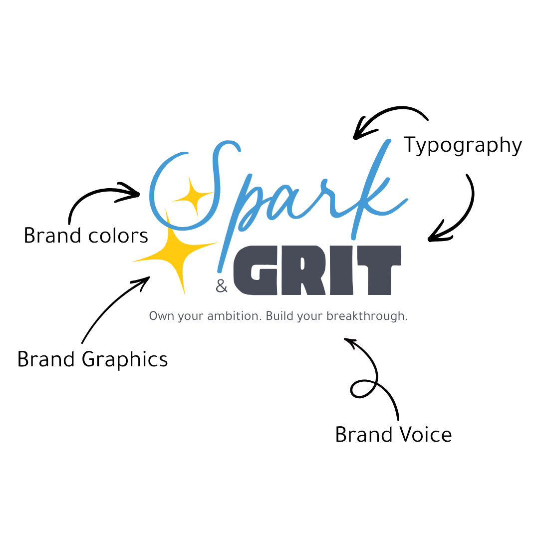
Brand Identity helps determine what your logo becomes.
Colour Palette
Colour sets a mood faster than almost anything else on a page. Soft, muted tones read as calm. Bright, saturated ones read as energetic. The same exact colour can feel completely different depending on what it sits next to.
Typography
Fonts carry tone the same way a voice does. A tall, formal serif reads differently than a soft sans-serif, and a handwritten-style script reads differently again. The right typeface backs up what the rest of the brand is already saying. The wrong one contradicts it, and sometimes it goes further than that. A thin, decorative font that looks lovely in a mockup can be hard to read for a lot of people, especially at smaller sizes or in lower contrast against the background. A font nobody can read isn't doing its job, no matter how well it matches the mood.
Photography and Imagery Style
Bright, candid photos say something different than moody, styled ones. A business that mixes styles without meaning to ends up sending mixed signals along with them.
Graphics, Icons, and Patterns
The small, repeated visual details, an icon style, a pattern, a way of framing a photo, are what make everything else feel like it belongs to the same brand instead of a stack of separate choices.

Voice and Language
This is tone in words instead of visuals: word choice, sentence rhythm, how much personality or edge fits. A preschool probably shouldn't be dropping F-bombs in its brand voice, no matter how good their logo looks.
All five pieces are doing the same job from different directions, making sure a business feels like one consistent thing, everywhere someone runs into it.
Why Consistency Is What People Remember
A finished brand identity doesn't create recognition the moment it's done. Recognition takes time to build, the same way a stranger's face only becomes familiar after you've seen it enough times. Nobody remembers a brand from one encounter. They remember it because the same colours, the same type, and the same voice kept showing up, over and over, until recognizing it stops taking any real thought at all.
That same repetition is also why switching things up along the way costs more than it seems to. Swapping a colour palette every few months, or sounding completely different depending on the platform, resets that recognition back to zero each time, no matter how good any single piece looks on its own.
Staying consistent gets a lot easier once a brand identity is fully built out, especially with a brand guide to check against. That one document lays out the colours, the fonts, and the rules for using them, so nothing has to be re-decided or guessed at each time.
I use a free browser extension called Color Buddy almost every day to keep colours consistent across my own brand and every client's. It stores brand palettes and makes copying hex, RGB, and CMYK codes easy across any site, so pulling up the right shade takes a few seconds instead of a guessing game.
Getting the small, repetitive stuff right is what eventually makes a brand recognizable in a crowded feed without needing a caption to explain who posted it.
Neither One Works Alone
A logo built without any brand identity behind it usually doesn't turn out strong either. Colour, type, and shape choices are supposed to come from decisions about who a business is. Skip that step, and the logo ends up guessing at those same things instead of building from them.
The same goes in reverse. A brand identity built around a weak or rushed logo carries that weakness into everything else, since the logo is usually the first piece people see.
A brand identity is supposed to shape what the logo becomes, not the other way around, and not as two equal, separate choices either. One piece feeds directly into the other.
Despite how often the two get treated as the same thing, or pitted against each other like one has to win, they work best built together, one shaping the other from the start. A business that only builds one of these pieces ends up less recognizable than it could be, no matter which piece got skipped.
If this sounds like your business, whether that's a logo with nothing built around it, or a handful of pieces that never quite came together, book a free consult and we'll take a look at it together.
