

How to Give Your Website Personality

Read time: 5 min
You are the kind of person who remembers a client's dog's name. Who checks in after a hard appointment. You are so warm in person, but does your website show that same warmth to someone who hasn't met you yet?
This happens to even the most caring business owners all the time. You pour everything into your clients, so the website gets built fast, from a template, with whatever photos were easy. It works, technically... though it could belong to any business in your field. That means the warmth that sets you apart never makes it to the person deciding whether to reach out.
Your warmth tends to come through in three places: your photos, your words, and your colours. When any of them feels generic, that's usually where a visitor loses the sense of who you are. Maybe that's one of the three for you. Maybe it's all of them. Let's take a look at each.
Your Photos
Photos are usually the very first thing a visitor takes in. A stock photo of a smiling stranger fills the space, sure, but it could sit on anyone's site. A real photo of you, your space, or the people (and animals) you help lets someone feel like they've already started to meet you.

That kind of photo builds warmth and trust at the same time. Picture a client who books because your website showed a bright, cozy office with a big soft pink chair, then walks in and there it is, exactly like the photo. That moment tells them everything they hoped was true actually is.
Now picture the opposite. Your site shows a clean, modern, almost sterile office, but your real space is colourful and warm and full of you. Did a client looking for cozy quietly skip booking with you, never knowing they'd have loved it there?
A stock photo, or an AI-generated person giving uncanny valley, makes a visitor feel uneasy, even if they can't put their finger on why. Your ideal client is deciding whether they can trust you with something that matters to them, a nervous dog, a hard season, their family. When your photos are authentic, they can carry both the warmth and the reassurance that you're exactly who you say you are.

Pretty & warm, but uncanny feeling because it’s overdone ai

Professional but lacks warmth

Warm, authentic, non-distracting background

Not perfectly posed but full of warmth, personality, and shows connection with the dogs

Beautiful, warm woman with great lighting but her background distracts from the focus on her.
Real doesn't mean careless, though. A cluttered background, a stain on your shirt, or a bit of resting bitch face can undercut all that warmth just as fast.
This isn't about having a fancy camera. Plenty of warm, genuine photos are taken on a phone. It's about a little care: good light, a background that doesn't distract from you, and a photo that actually matches the vibe of your site. A calming wellness page and a sweaty photo of you crowd-surfing at a metal concert send two very different messages, and your visitor will feel the mismatch even if they can't name it.
Your Words
The words on your site are where a lot of business owners lose their warmth, right when they'd most want to sound like themselves. It's the difference between "We provide licensed childcare in a safe, structured environment" and "Your little one gets snacks, songs, sticky-fingered art projects, and a whole lot of love while you're at work." Same fact. Completely different person coming through.
Most people don't write the stiff version because it's better. They write it because it feels safe. When you want to be taken seriously, warmth can feel a little risky, so it gets scrubbed out in an attempt to sound more competent. Your ideal client is looking for expertise, that part is true. They're also looking to feel a connection. Your knowledge is what shows them you can help, and your warmth is what makes them comfortable trusting you with it.
It's hard to strike that balance, and it's a big part of what makes a good copywriter worth every penny. You can show your expertise and be warm at the same time, and that combination is what builds trust and comfort for the people thinking about working with you.
Your Colours
Colour sets a mood faster than anything else on your site. Soft and muted feels calm. Bright and saturated feels playful. Lots of white space and sharp lines feel clinical. Does the mood your palette sets match the one you want your clients to feel?
It's harder to know than it sounds, because the same colour shifts depending on where it lands. You see a deep burgundy you love on someone else's page. It feels rich and cozy there, so it goes on yours too. That same burgundy can feel warm and inviting in a bakery's hands and heavy or severe on a children's music teacher's site. The colour didn't change. The feeling it creates depends entirely on who's using it and what it sits next to.
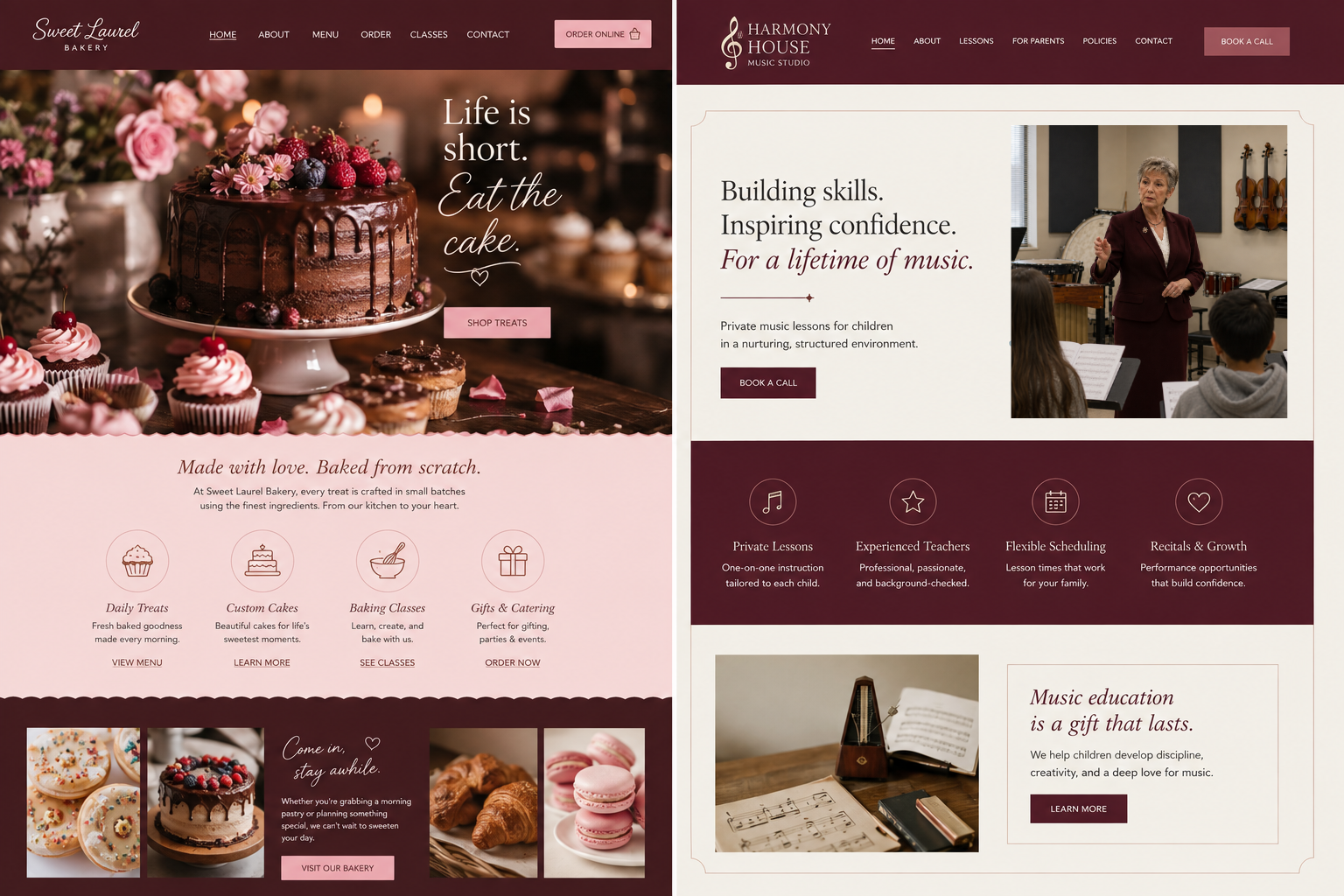
The right colours that fit you and your clients don't just decorate the page. They make someone feel welcome, understood, and sure they've found the warm, caring provider they needed.
Bringing the Warmth Through
Your photos, your words, and your colours are always making people feel something when they find you. Is that feeling the warmth you want them to walk away with? When all three line up with who you are and who you're here for, the care you put into your work reaches people right from the start.
If you're wondering how your own brand and website are doing on that, an audit is a solid place to start. It's a fresh, caring look at what's working and what isn't. It checks the warmth, and so much more, all the pieces that decide whether your hard work actually reaches people. You give so much to the people you serve. Your brand and website should give that back to you.
Everything we just talked through lives in both your brand and your website, so a Brand Audit or a Website Audit will both show you where your personality is coming through and where it isn't. Whatever else you want reviewed can help you decide between them. Take your pick, or grab both.
