Paws N’ Play
Website Design

Project Overview
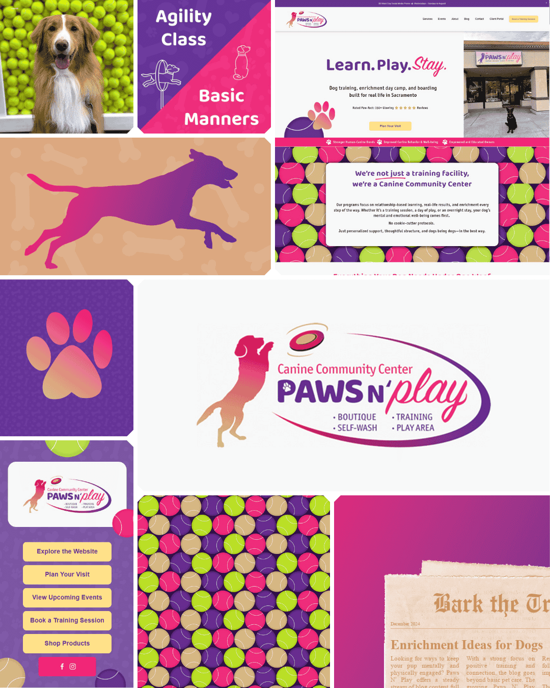
Terra Ruiz came in with a brand she loved and a website that wasn't doing it justice. Paws N' Play is a dog training, enrichment day camp, boarding, and retail store in Sacramento, CA, and the energy of the business is exactly what you'd hope for: fun, playful, and full of personality. The website just wasn't showing any of that yet.
The palette was there (a happy mix of pink, purple, and sandy tones) but the balance was off, leaning so heavily into the sandy color that the personality got buried. Add a text-heavy layout with a giant contact form as the first thing you see, and a WordPress setup that made even small updates a struggle, and the site was working against itself in every direction. The goal was simple: fix the balance, fix the function, make it easier to manage, and let the fun through.
Project at a Glance
| Client | Terra Ruiz |
| Business | Paws N' Play |
| Industry | Dog Training, Enrichment Day Camp, Boarding, Retail |
| Services Provided | Website Redesign, Graphic Design |
| Platform | Squarespace |
| Location | Sacramento, CA |
| Live Site | pawsnplay.dog |
Website
The Goal
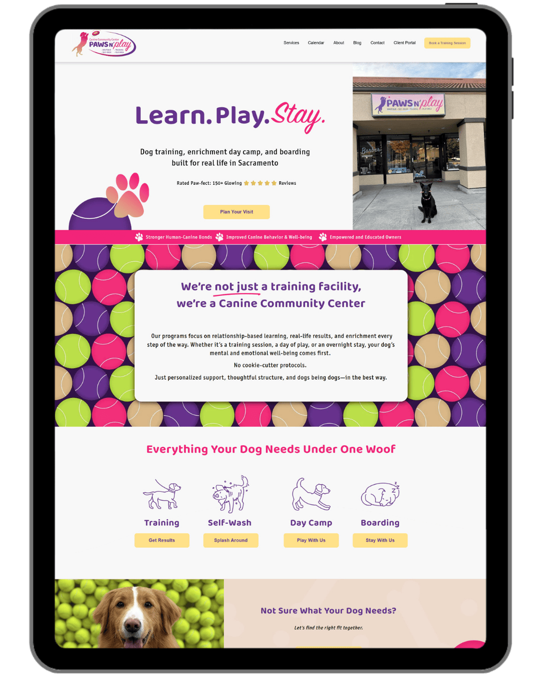
A fun, balanced, functional website that actually reflected the personality of the business. The branding was solid, it just needed to be used better. More pink and purple up front, the sandy tones as a supporting player rather than the star. Better structure so visitors could find what they needed quickly, and a site that felt as lively and welcoming as walking through the actual door. And for Terra herself, a platform she could actually open up and make changes in without it turning into a whole thing.
The Challenge
Paws N' Play offers a lot (training, day camp, boarding, retail) and each service needs enough explanation to help a new visitor understand what they're signing up for. The challenge was balancing that amount of necessary text with smart formatting, color blocks, and imagery so the site never felt like homework. Every page needed to inform and delight at the same time. Moving platforms also meant making sure nothing got lost in the transition while building something genuinely better on the other side of it.
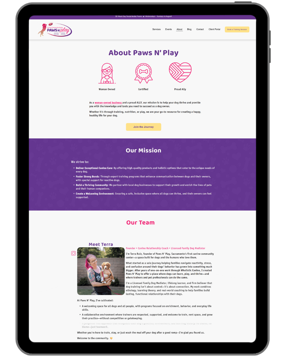
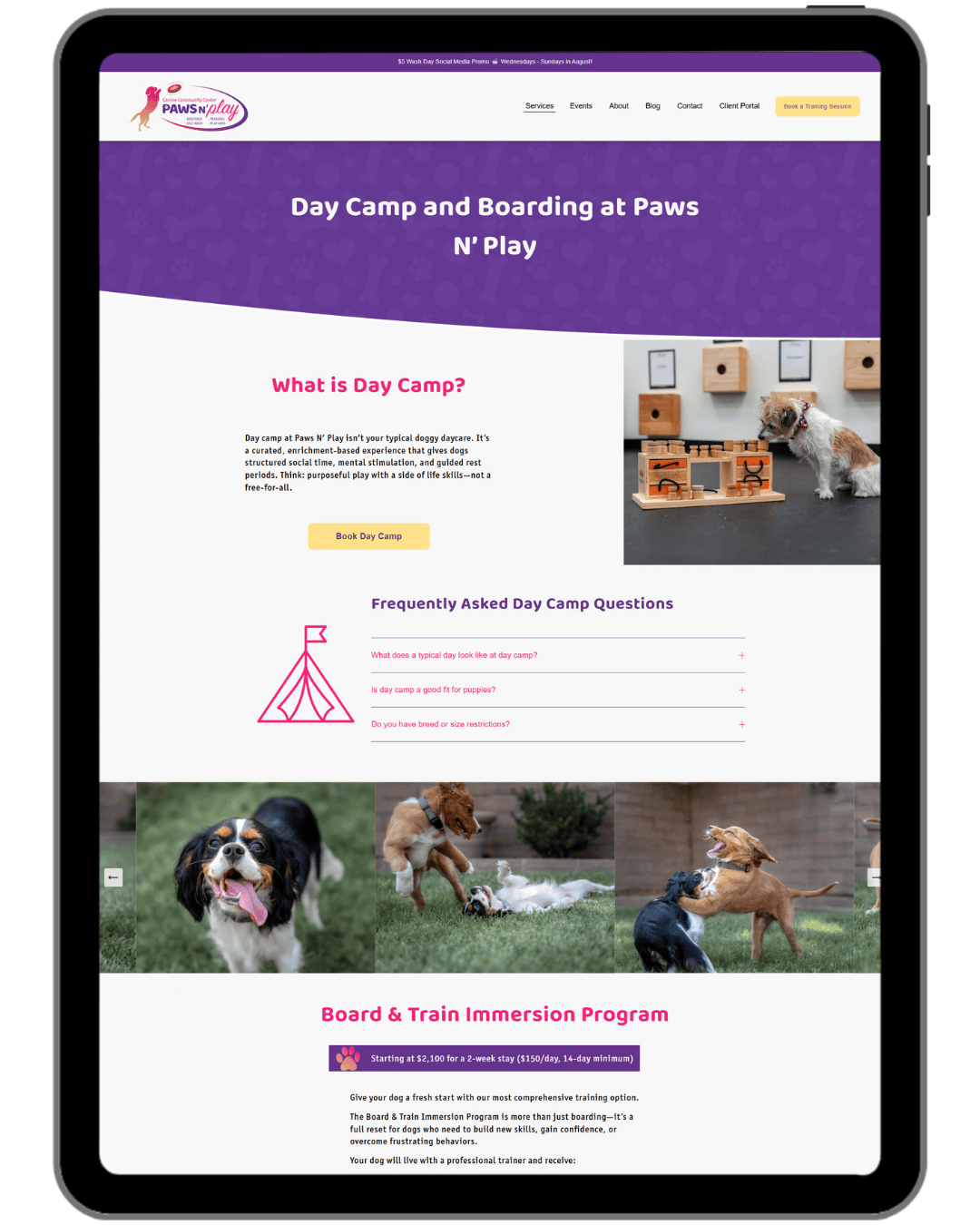
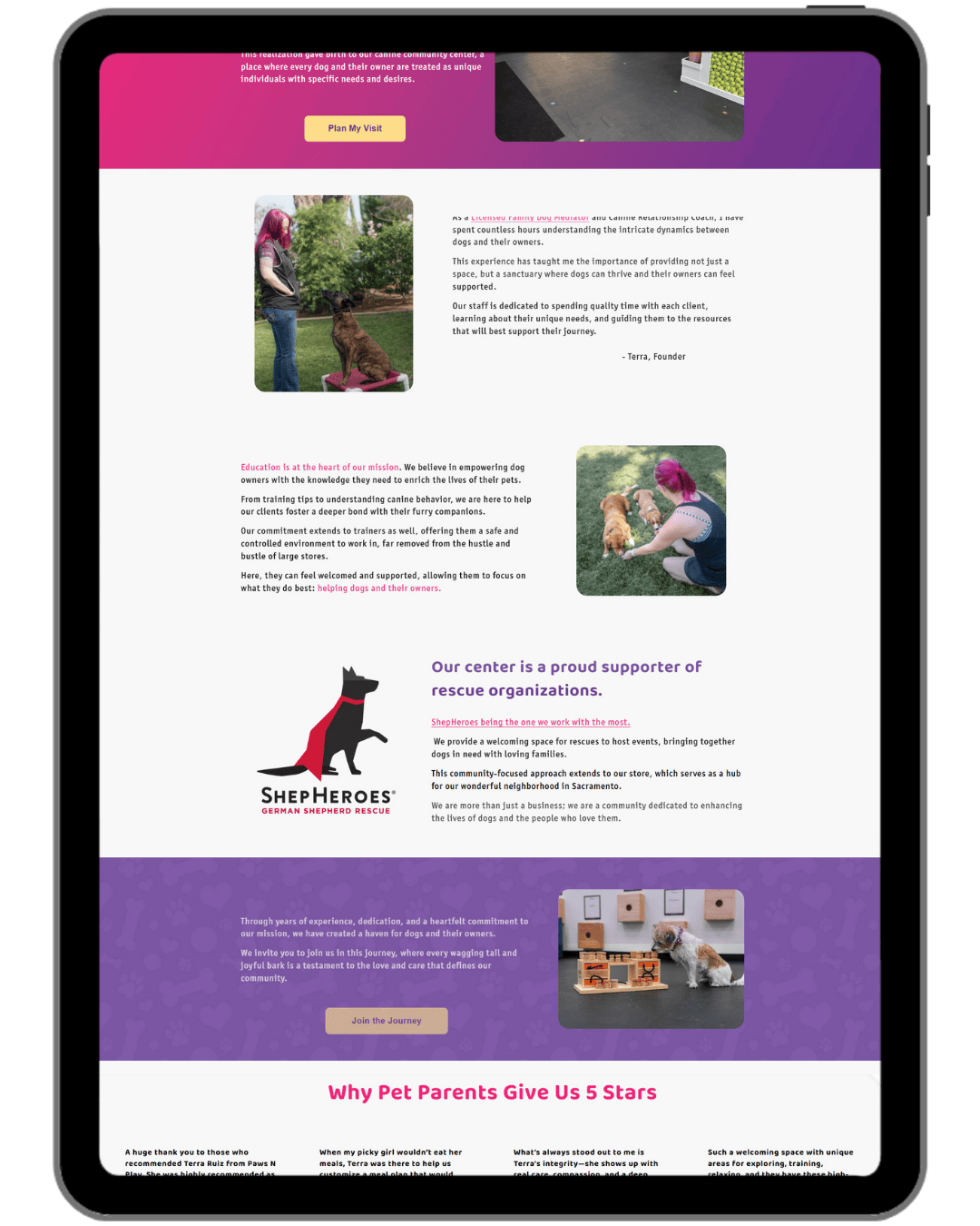
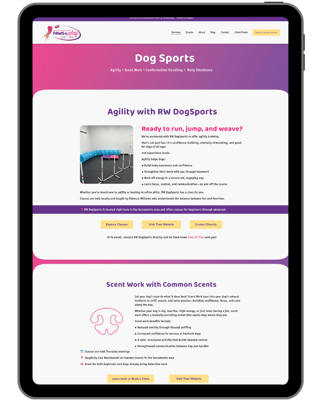
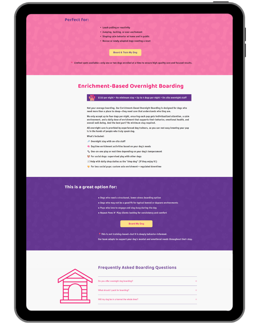
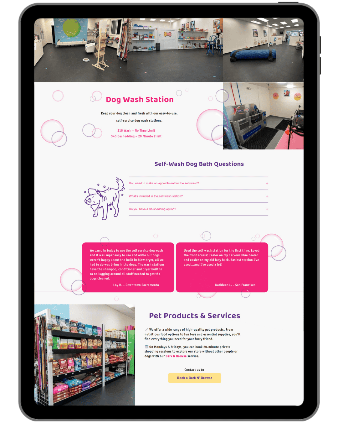
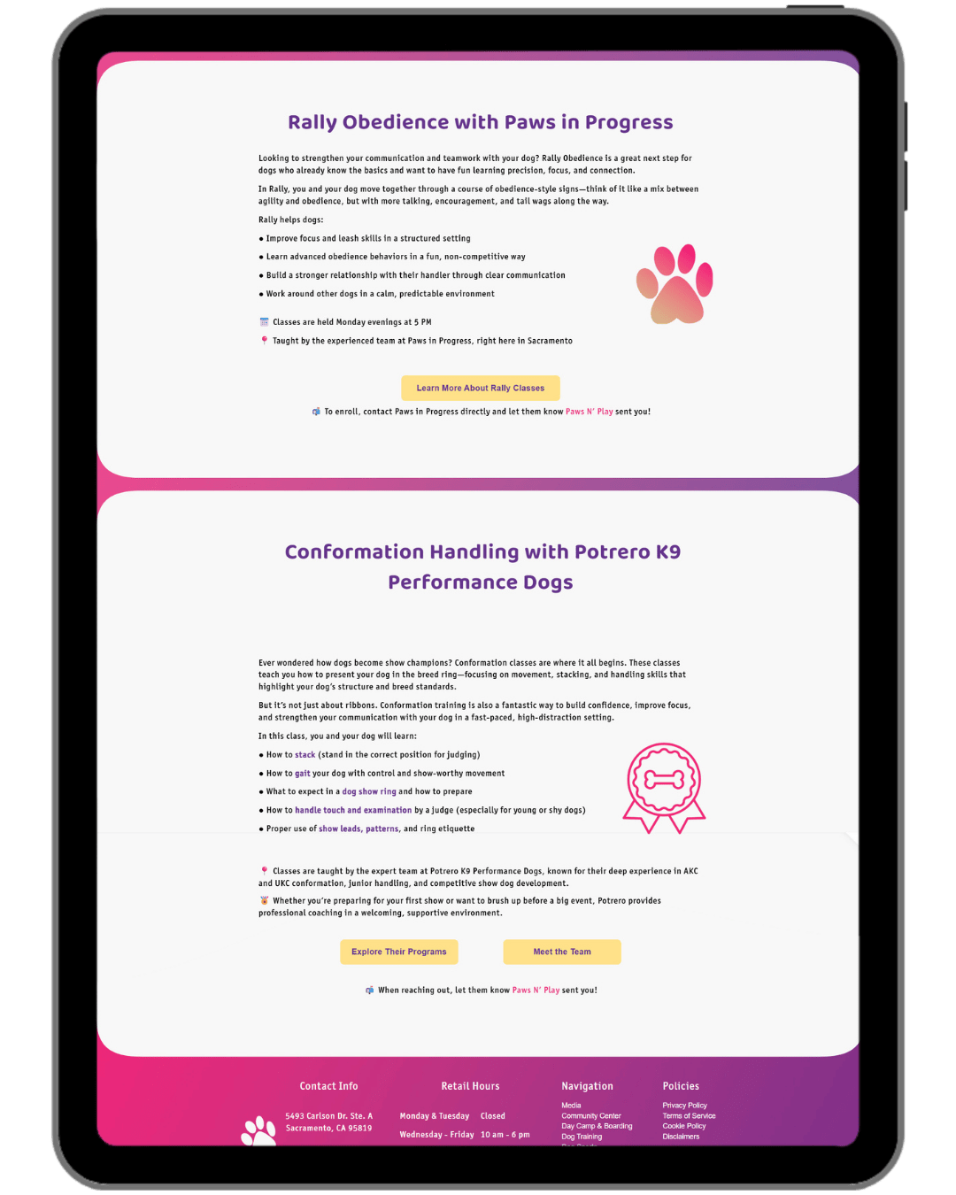
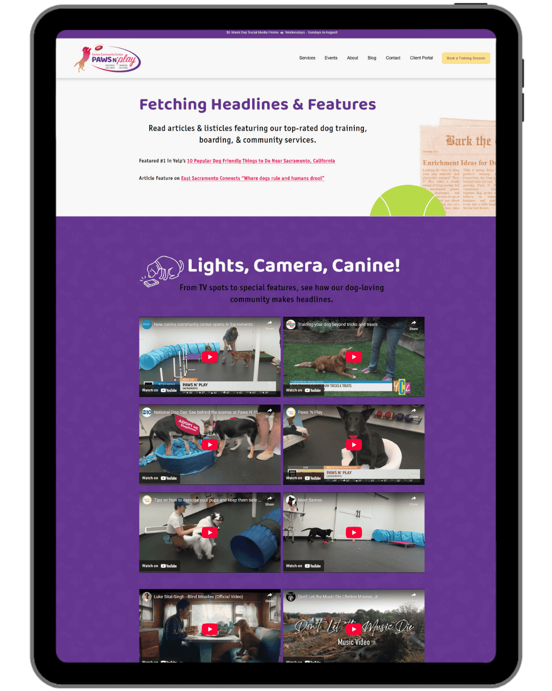
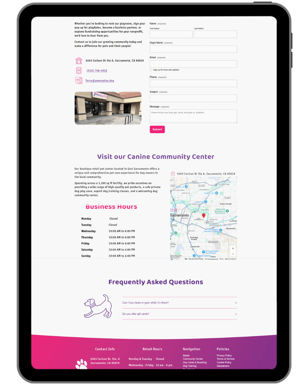
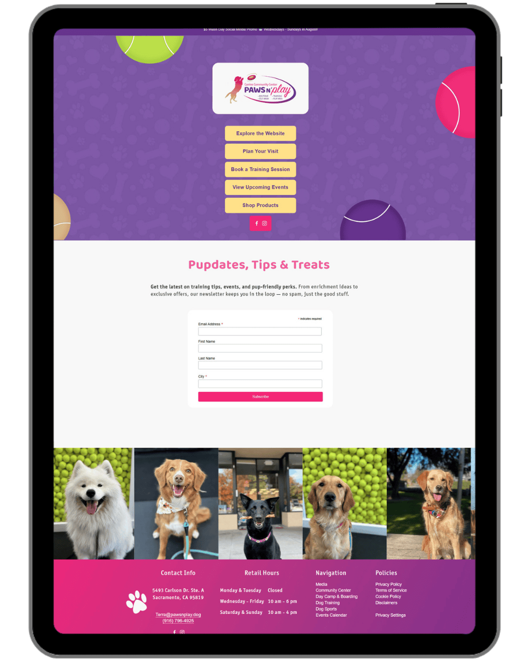
Website Screenshot Gallery
The Result
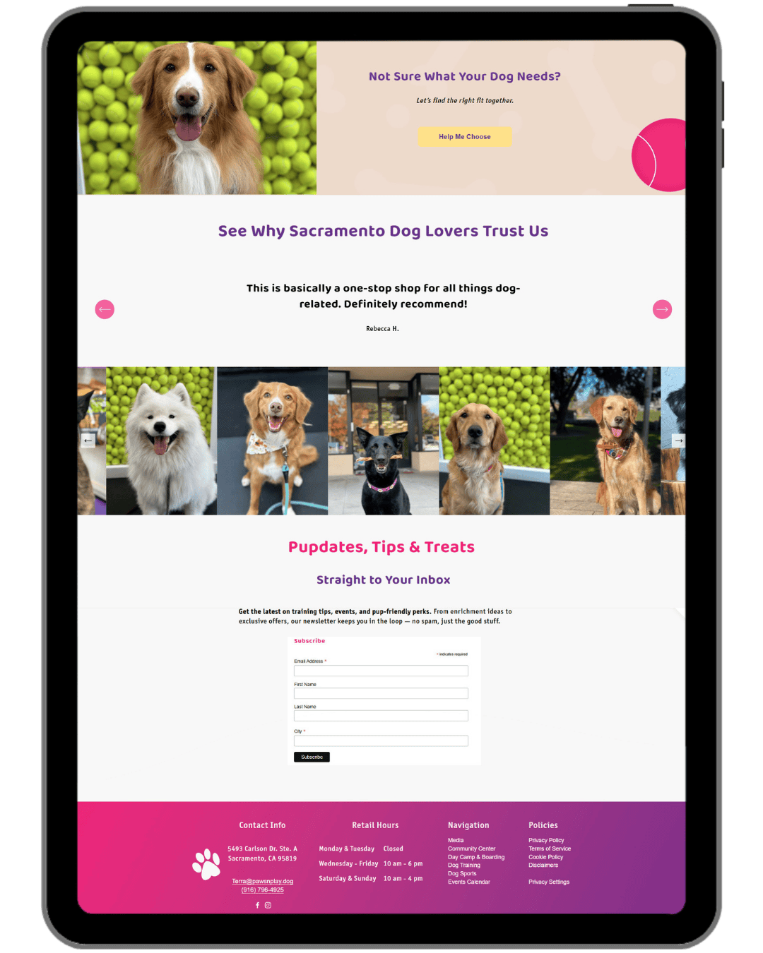
A colorful, happy website that finally lets the brand breathe. The pink and purple do the heavy lifting now, with the sandy tones adding warmth rather than taking over. Color blocking and images break up the text so pages feel easy to move through, and the personality comes through in every scroll. Tennis ball graphics are sprinkled throughout as a playful nod to the iconic tennis ball filled checkout counter, with a tennis ball pattern used occasionally as a background texture for an extra touch of fun. The booking software integration means visitors can go from browsing to booking without in a seamless transition. The members-only community page gives class participants their own dedicated space, which is a lovely little detail that makes existing clients feel taken care of. And perhaps most importantly for Terra day-to-day, she now has a Squarespace site she can actually open up and update herself, without needing a tutorial every time something needs to change.


Before and After
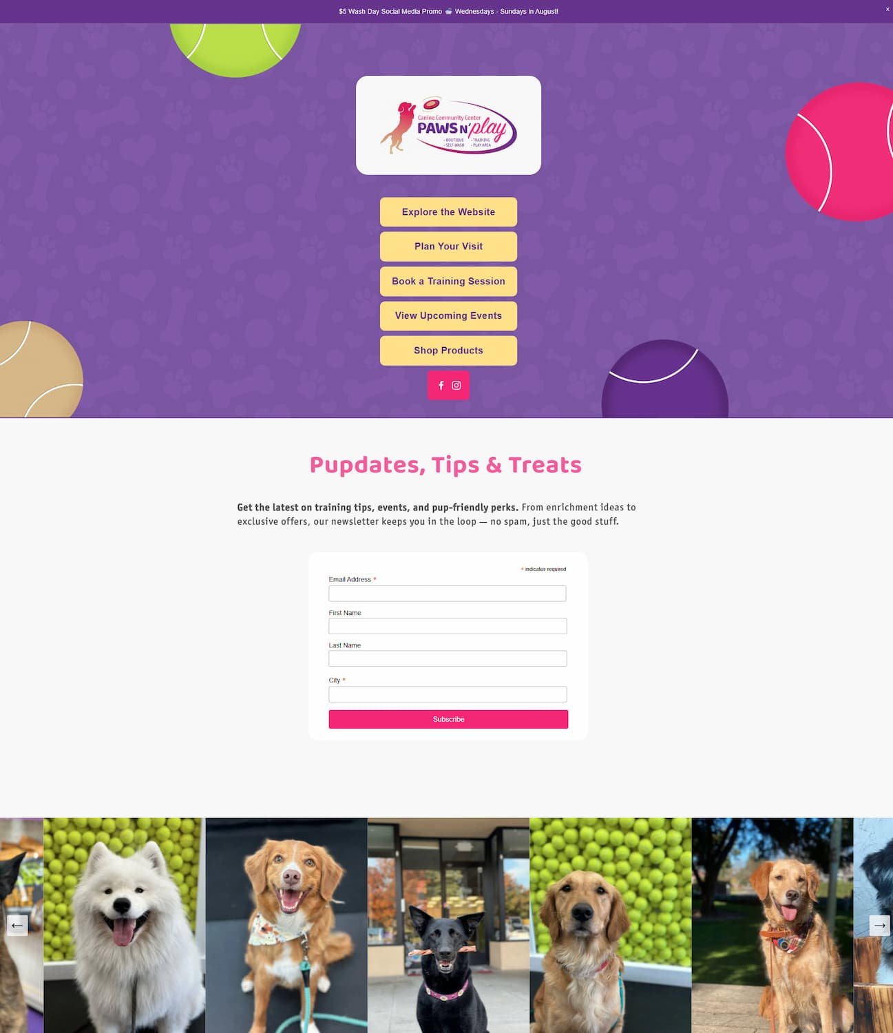


My favorite page in both desktop & mobile!
What Was Delivered
Custom Squarespace website redesign
Home, About, Services, Contact, and standard pages
Community page (members-only, for class participants)
Media page
Link in Bio page
Events calendar page
Booking software integration
Fully mobile-responsive design
Domain setup
Basic SEO (titles, descriptions, image alt text, page structure)
Website strategy session
Website content support (guidance and editing)
Built-in guidebook
Launch training walkthrough
Kind Words from The Client
"The follow-up and proofing system were fantastic, and the page-by-page review over video allowed me to go at my own pace and really take everything in. It made the whole experience stress-free and enjoyable. Highly recommend!" — Terra Ruiz, Paws N' Play
"I couldn't be happier with my experience! I loved everything about the process, the beautiful colors, the thoughtful design, and the attention to detail." — Terra Ruiz, Paws N' Play
Graphic Design
The Goal
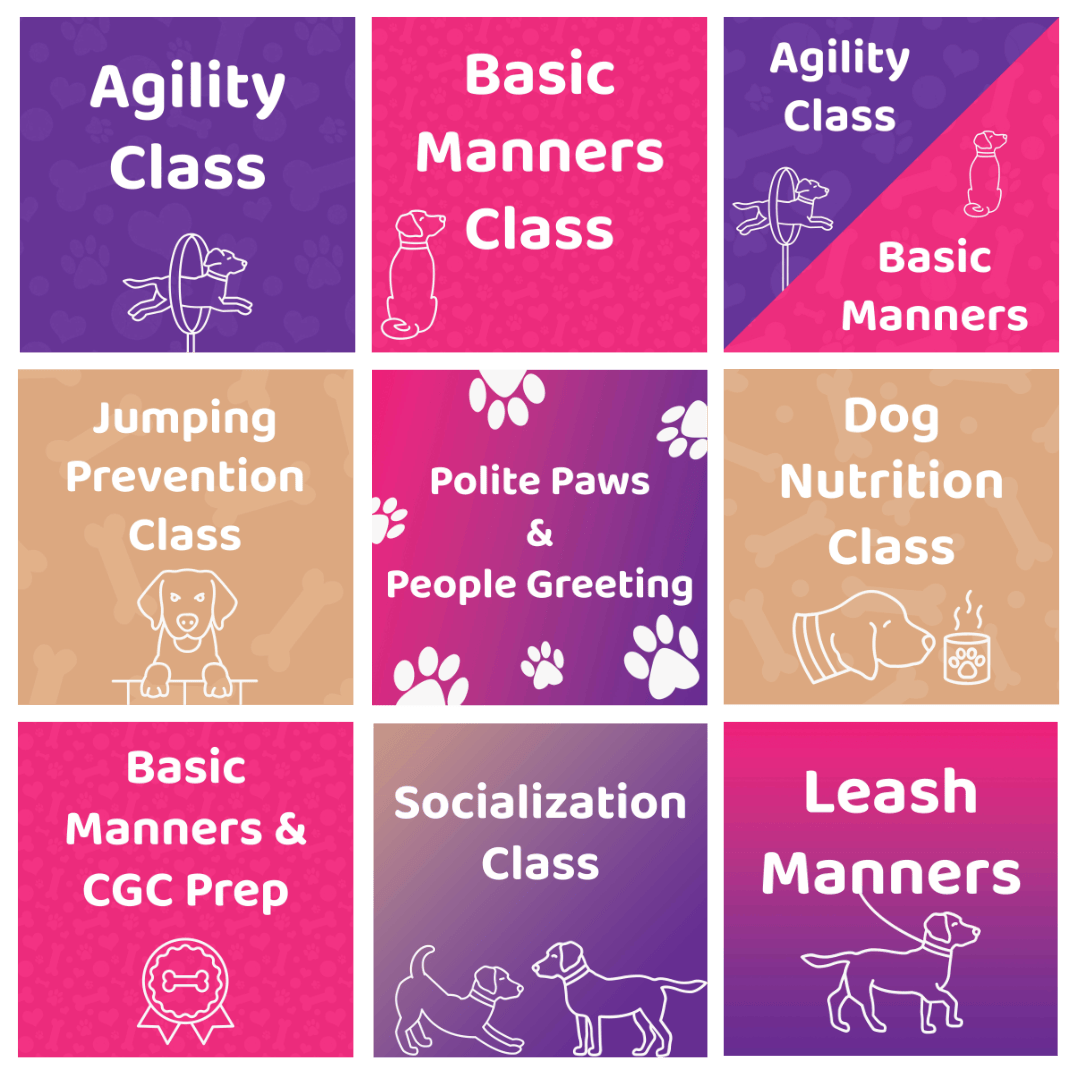
Terra needed a set of branded graphics for her events calendar, one for each class type, that could be reused ongoing every time that class appeared on the schedule. Simple, on-brand, and practical.
The Challenge
With a visually busy, personality-packed site, the graphics needed to feel cohesive without competing with everything else on the page. They also needed to be clear and readable at calendar size, where there isn't a lot of real estate to work with.
The Result
A clean set of reusable class graphics, each displaying the class name in a way that's on-brand and easy to read. Terra can drop them into the calendar as needed without any extra design work every time a class rolls around.
What Was Delivered
Reusable class name graphics for events calendar (one per class type)
Calendar Pack