Life & Death Services
Website with Light Branding + Letterhead & Business Card

Project Overview
Cinda Gillilan arrived with a big vision and absolutely nothing in place yet. No website, no brand, just a whole lot of heart and a genuinely one-of-a-kind collection of services. Life and Death Services holds the full spectrum of human (and animal) experience: grief support, end-of-life planning, spiritual direction, pet loss, ESL tutoring, and wedding officiating. Yes, all of that. And somehow, it all makes beautiful sense together.
She needed a brand and website that could hold all of it without feeling chaotic. Something that honored the weight of the harder topics while still feeling warm and hopeful. The word she kept coming back to was comforting. I built her a full brand identity from scratch, a custom 13-page Squarespace website, and a suite of print materials to match. This was also the project that became the blueprint for the video revision walkthrough process I still use today.
Project at a Glance
| Client | Cinda Gillilan |
| Business | Life and Death Services |
| Industry | Grief Support, End-of-Life Planning, Spiritual Direction, ESL Tutoring, Wedding Officiant |
| Services Provided | Website Design + Light Branding, Business Card Design, Letterhead Design |
| Platform | Squarespace |
| Location | Silver City, NM |
| Live Site | lifeanddeathservices.com |
Light Branding
Primary Horizontal Logo

Logomarks
Palette

Graphics
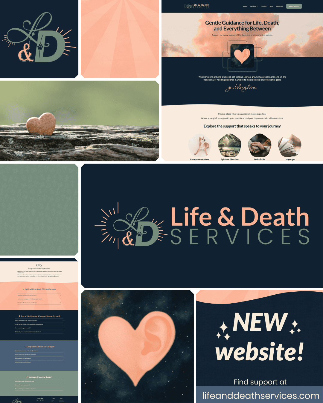
Mood Board
The Goal
Cinda had never had a brand before. No logo, no colors, nothing to build from. She knew what she didn't want (dark, moody, heavy) and she had a clear feeling she was after: hopeful, caring, grounded. The kind of presence that makes someone exhale when they land on her page.
The Challenge
The palette had to do a lot of heavy lifting. It needed to work as a unified whole and still give each service area its own personality. Too dark and it would feel like a funeral home. Too bright and it would feel dismissive of the weight people carry when they come to her. Genuinely the hardest part of this project... and also the most fun.
The Result
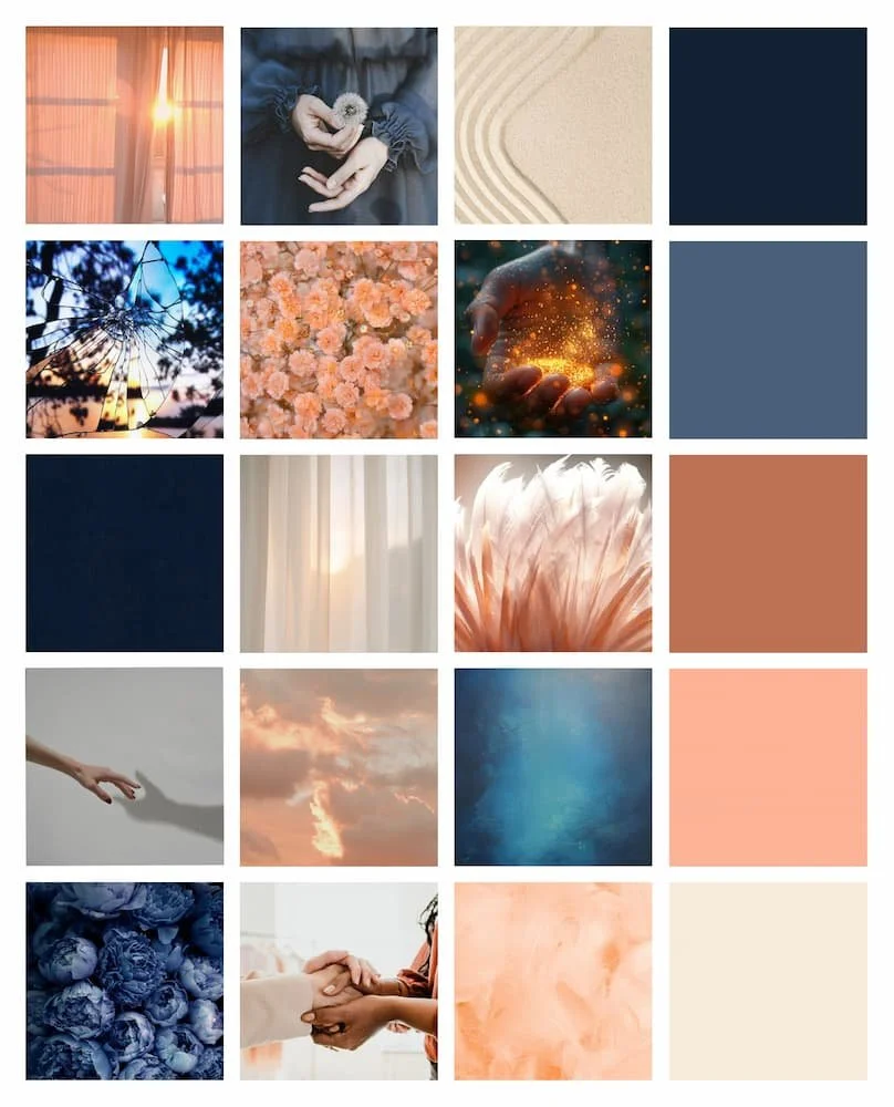
Five colors, each with its own name and its own emotional job to do. Holding Space (deep navy) anchors the brand without making things feel heavy. Heart of Care (peach) brings the brightness and joy (and does most of the work on the officiant page, where it absolutely belongs). Peace Grows (sage) is the natural, grounded secondary, perfect for the end-of-life and green funeral content. Understanding Sky (slate blue) and Quiet Compassion (soft cream) accent and soften wherever the design needs a breath. Each color has a clear home on the site, so pages feel distinct while the palette keeps everything connected. The challenge and the result ended up being the same thing.
For the logo, I designed an "L&D" monogram in Peace Grows sage with scripty flourishes, paired with a bold "D" with a paw print nestled inside and rays radiating outward in Heart of Care peach (representing both hope and Reiki energy). The full wordmark sits beside it, "Life & Death" in peach and "Services" in sage. A lot of meaning in a small space, without ever feeling busy.
What Was Delivered
Primary logo design
Logomark (with 2 color variants)
Mood board
3 pattern designs
10 custom icons
Colour palette (5 named shades: Holding Space, Understanding Sky, Peace Grows, Heart of Care, Quiet Compassion)
Extended palette with tints and shades
Approved color pairings list (WCAG compliant)
Font selection and typography guide
Basic brand guidelines
✨
Website
The Goal
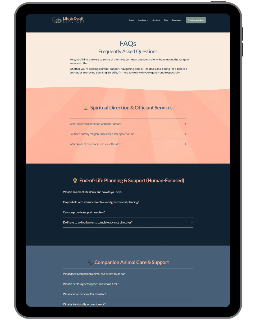
This was Cinda's very first website, built completely from scratch. The goals were twofold: book consultations, and educate. Her services aren't ones people always know they need until they read about them, so the site had to explain a lot, warmly. A blog and resource section were built in from day one, for her audience and for the long game of SEO.
Representation mattered from the start. Cinda's work welcomes everyone, and the site needed to reflect that. Stock photo sourcing was an opportunity to be thoughtful and intentional about making sure anyone landing on her site could see themselves there, and that's exactly the kind of extra care I'm always happy to put in.
The Challenge
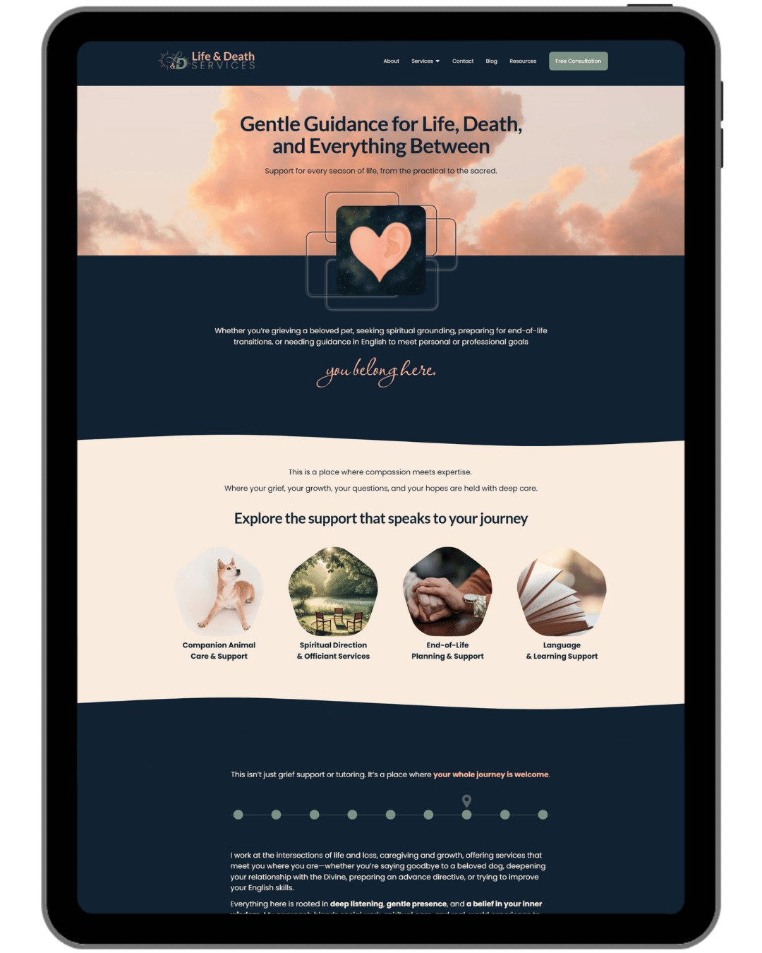
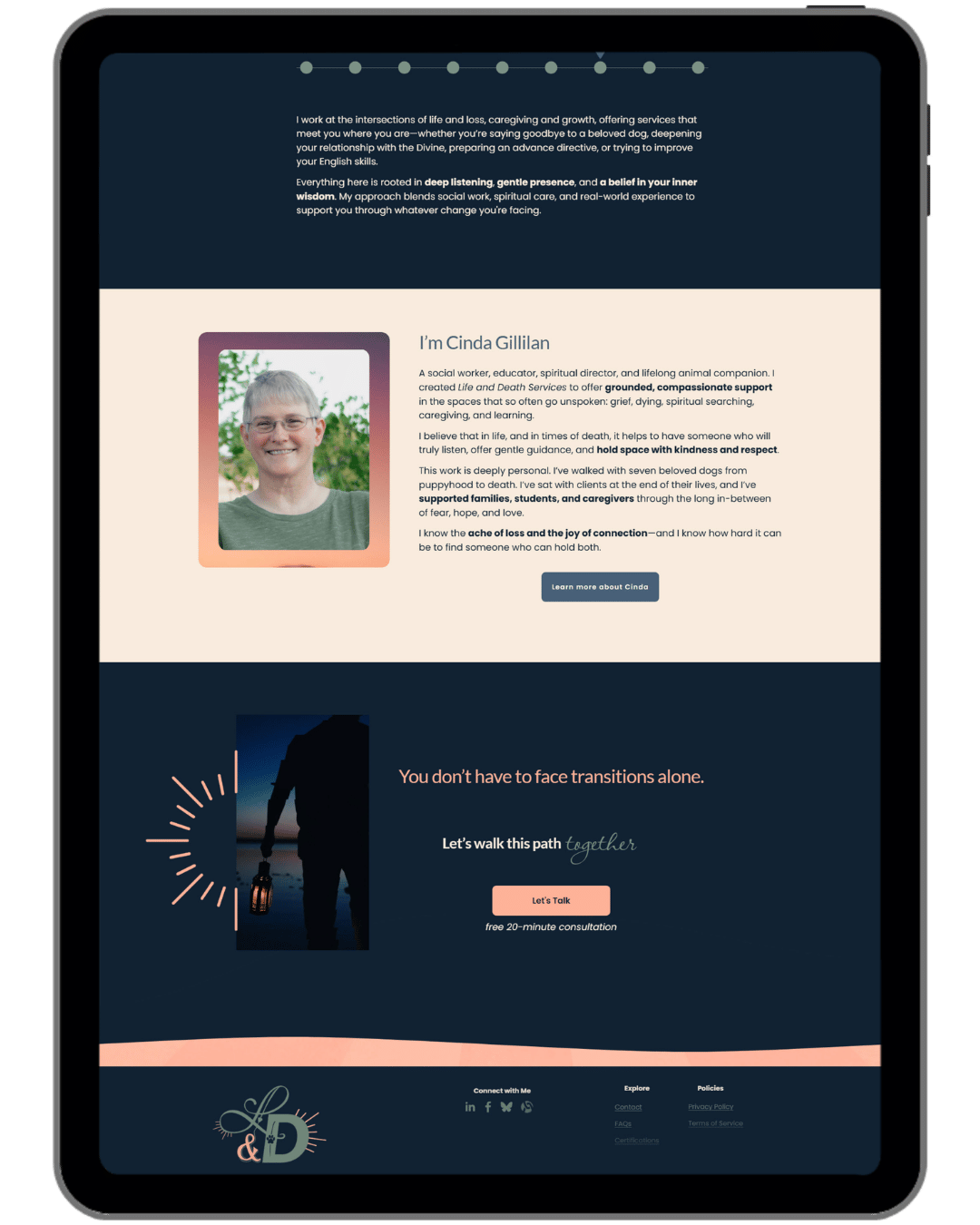
The biggest puzzle was presenting so many different services without the site feeling scattered. A grief counselor who also teaches English and officiates weddings needs a site that makes all of that feel intentional. Her audience also skews a little older, so readability was a real priority (slightly larger body text, clear navigation, nothing that requires squinting). And all of it had to feel calm. Not sterile. Calm, like a deep breath.
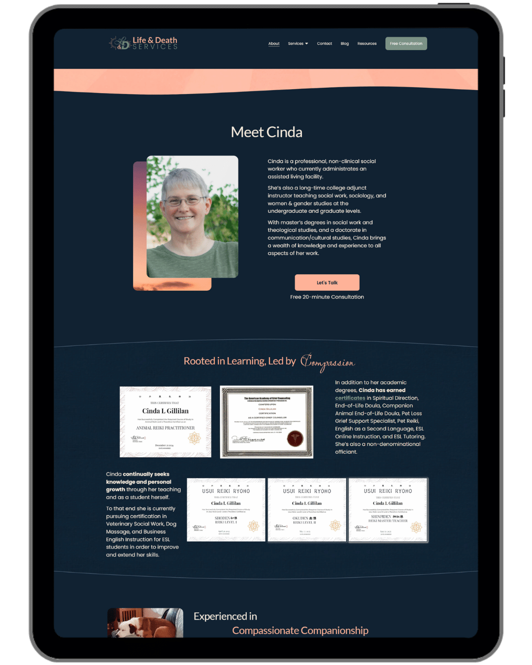
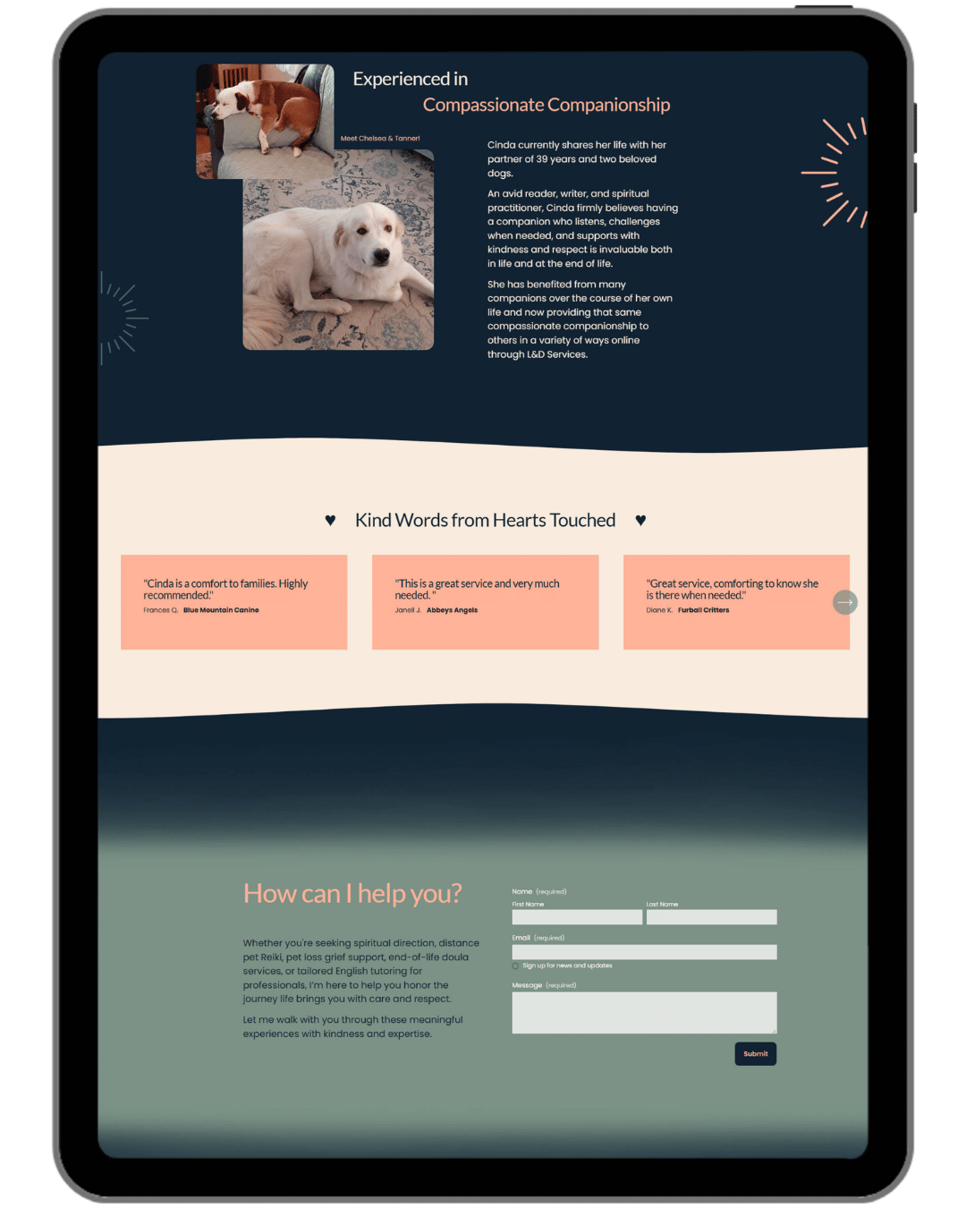
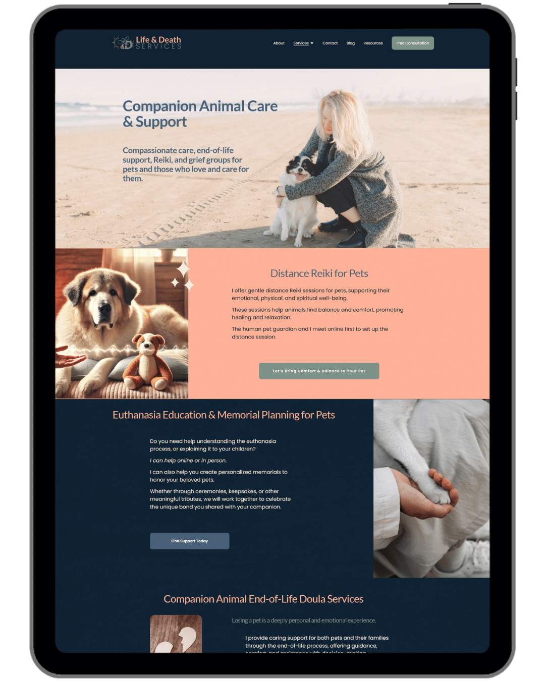
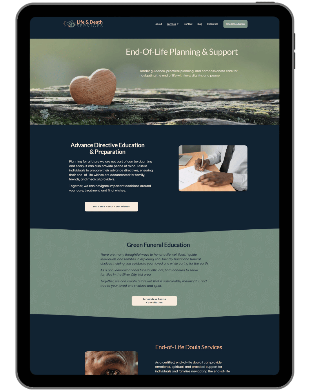
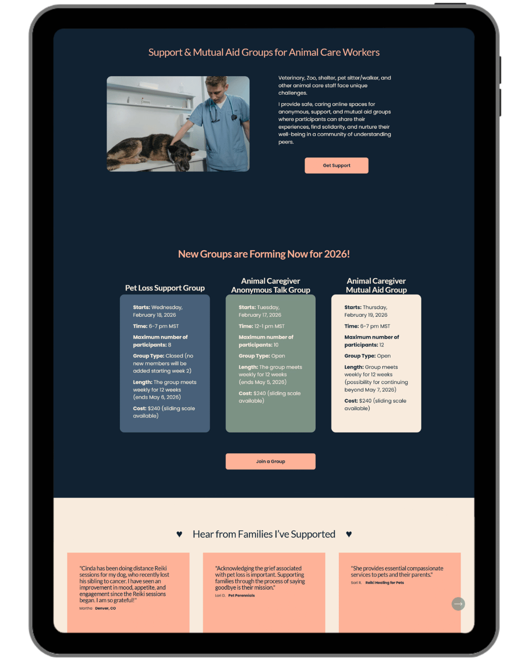
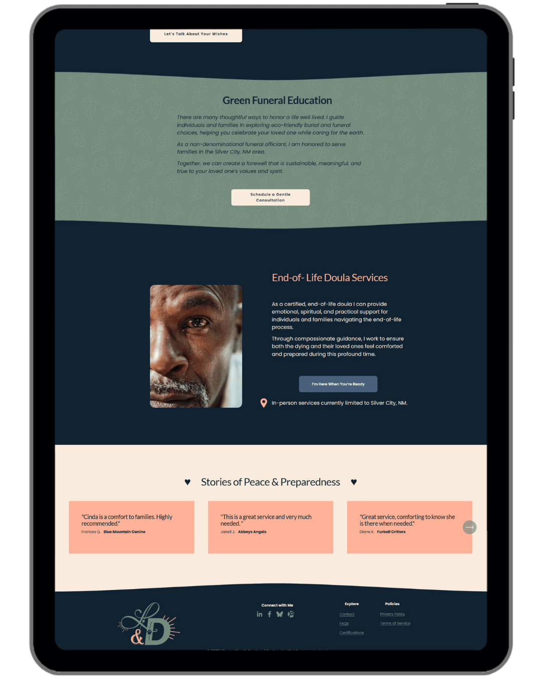
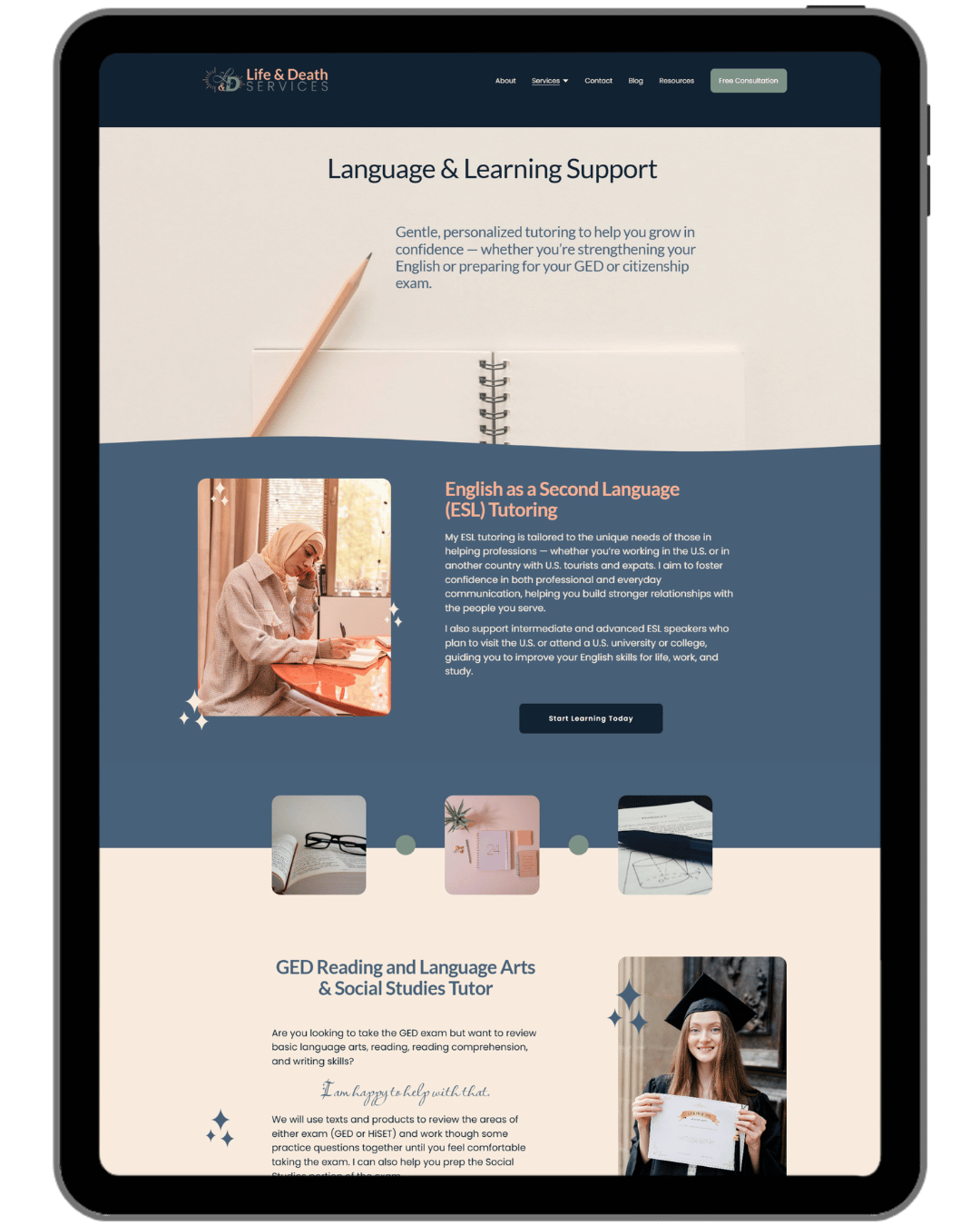
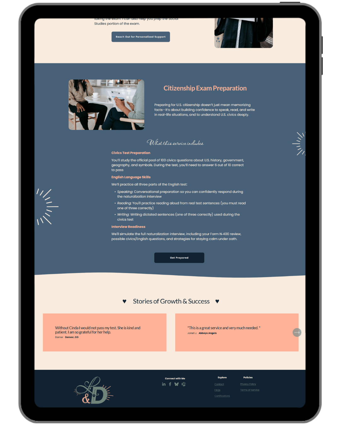
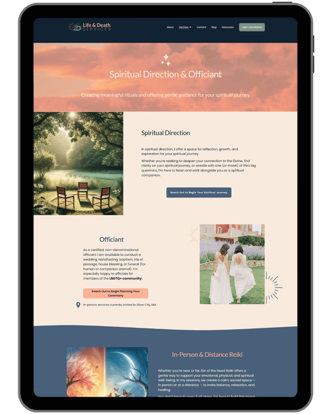
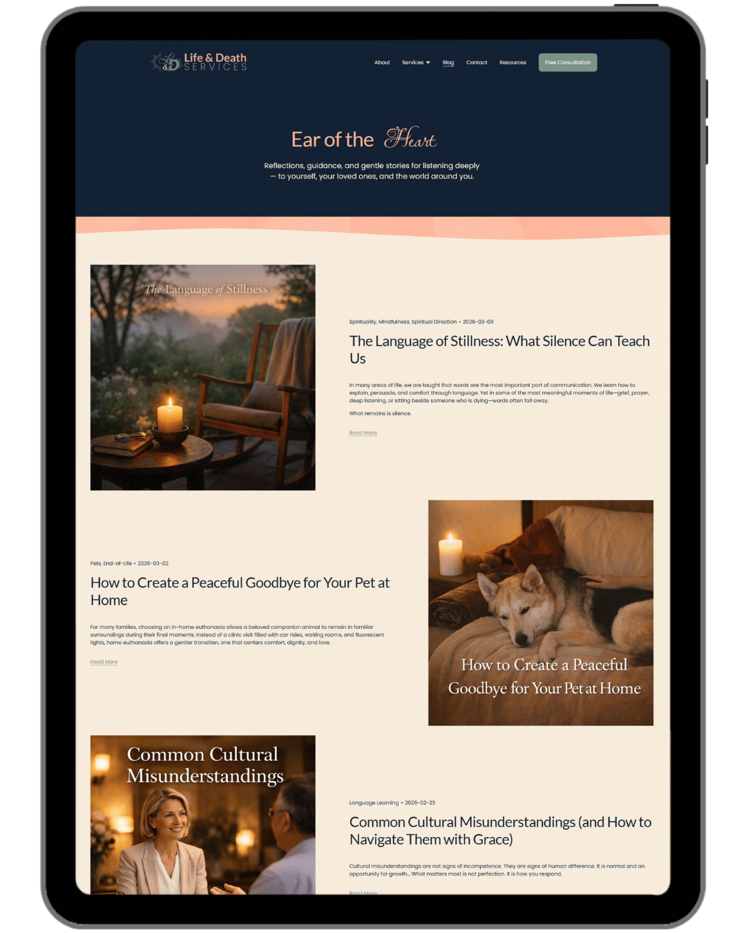
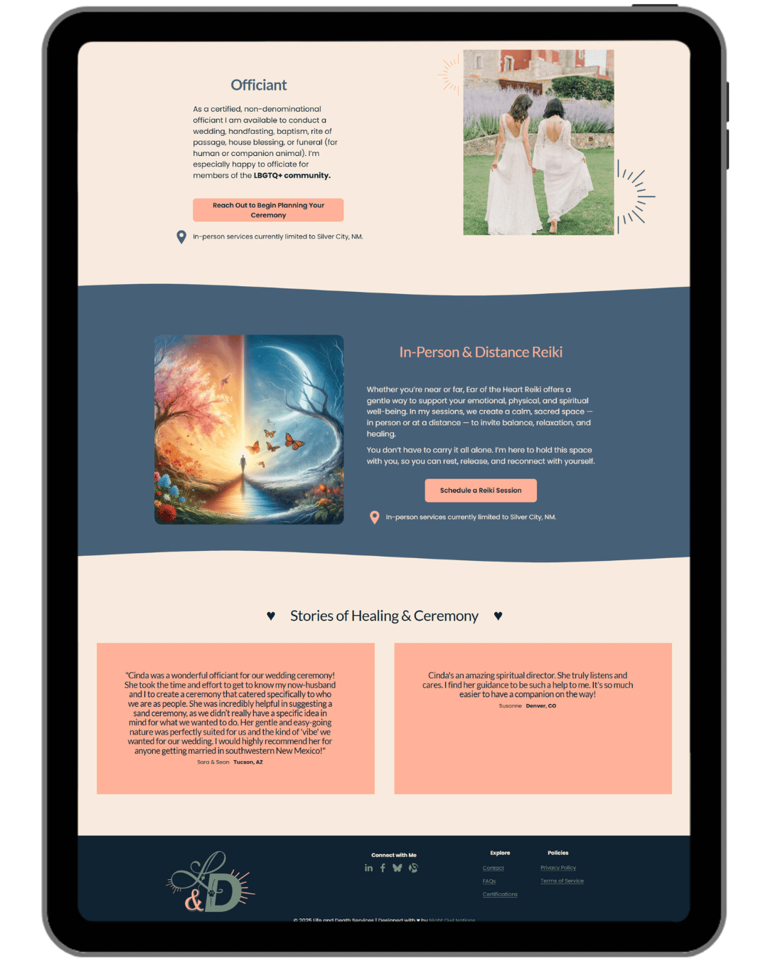
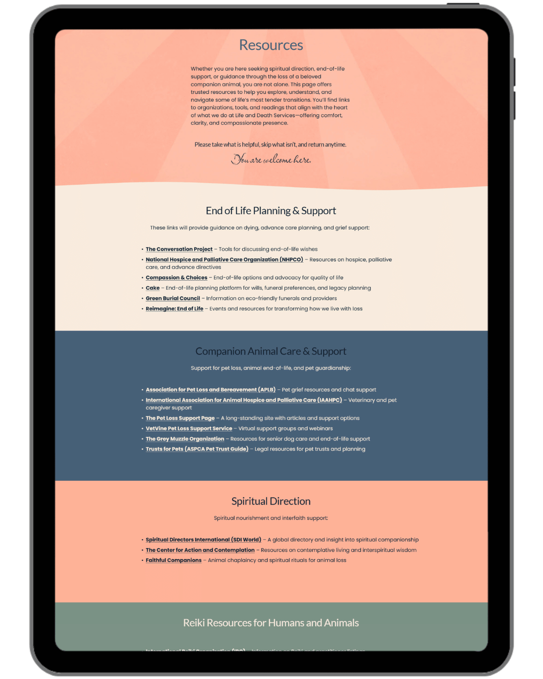
Website Screenshot Gallery
The Result
13 pages in total: home, 4 service pages, contact, resources, blog, FAQs, certifications, a media page (she was featured on a podcast shortly after launch, so it was put to good use right away!), a custom 404, and a coming soon page. The service pages are what I'm proudest of. Each one feels completely its own, with the palette doing the work of separating them while everything still belongs to the same site. Revisions were smooth and collaborative, and this was the first project where I used the video walkthrough format. It worked so well it's been part of my process ever since.
What Was Delivered
Custom Squarespace website (11 pages + custom 404 and Coming Soon, 13 total)
Domain setup
Fully mobile-responsive design
Zoom Scheduler integration
Basic SEO (titles, descriptions, image alt text, page structure)
Website strategy session
Website content support (guidance and editing)
Built-in guidebook
Launch training walkthrough
Custom favicon ("Ear of the Heart" design)
Stock photo sourcing with intentional diversity and representation
Custom website launch announcement graphic for social media
Kind Words from The Client
She doesn’t just build websites—she creates an experience that is thoughtful, organized, and empowering from start to finish. Her ability to listen deeply, translate vision into design, and guide clients through the process with clarity and care is truly exceptional. - Cinda Gillilan
Graphic Design
The Goal
Cinda needed print materials that matched the brand and could be used professionally right away. Polished enough to hand to a client or leave behind after an event, and just as warm and intentional as the website.
The Challenge
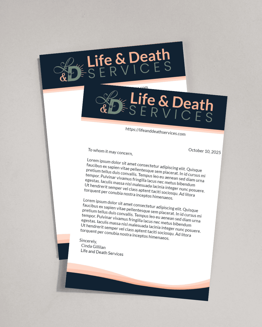
The letterhead needed to work in two formats: a print-ready PDF and an editable Google Doc for day-to-day use. Making something that looked great in both (one locked, one fully editable) took some finessing.
The Result
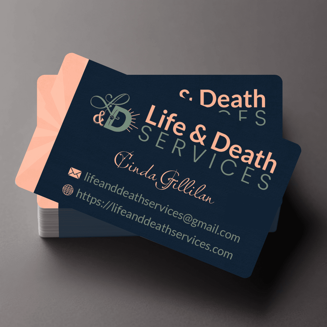
A business card and letterhead set that feel like a natural extension of the site. Consistent palette, same calm energy. The Google Doc format means she can write on her own letterhead without losing the look of the brand. A small thing that makes a real difference.
What Was Delivered
Business card design (print-ready)
Letterhead design, delivered as both a print-ready PDF and an editable Google Doc
Letterhead