
Millie’s Assisted Living
Website with Light Branding + Letterhead & Business Card

Project Overview
Millie's Assisted Living Community is not your average care facility, and it never wanted to be. Tucked into the heart of Silver City, NM, Millie's is a small, family-owned home for up to 15 residents, built around the belief that getting older doesn't mean giving up warmth, dignity, or a real sense of belonging. The building itself has quite a history (it was once home to Madam Millie, a legendary local brothel owner) and that layered, characterful past is very much part of what makes Millie's special today.
They came in with a logo they loved, a website that had seen better days, and a color palette that felt as outdated as the old site. Built on WordPress, the team didn't have the technical confidence to make even small updates themselves, leaving the site stuck and stagnant. The goal was to modernize everything, move them to a platform they could actually use, and keep the soul of the brand completely intact. And as an added layer of meaning, this project came to me through Cinda Gillilan of Life and Death Services, who partners with Millie's to offer her grief support, end-of-life planning, and spiritual care services directly to residents. That connection felt worth honoring on the site itself, which is why Cinda has her own dedicated page within the Millie's website, a natural and beautiful full-circle moment given that I had the privilege of building both of their online homes.
Project at a Glance
| Client | Millie's Assisted Living Community |
| Contact | Cinda Gillilan (acting on behalf of Millie's) |
| Industry | Senior Assisted Living |
| Services Provided | Website Design + Light Branding, Business Card Design, Letterhead Design |
| Platform | Squarespace (migrated from Wordpress) |
| Location | Silver City, NM |
| Live Site | milliesassistedliving.com |
Light Branding
Primary Horizontal Logo
Refreshed Logo

New Logo
Old Logo
Palette
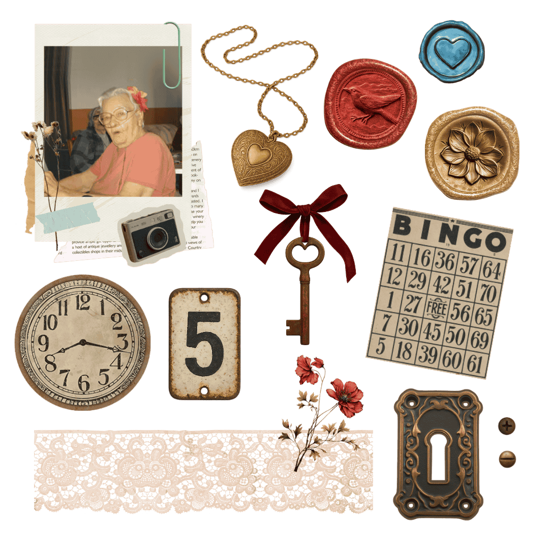
Graphics
The Goal
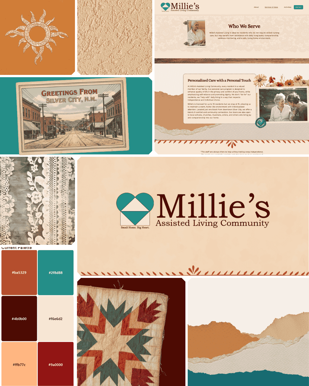
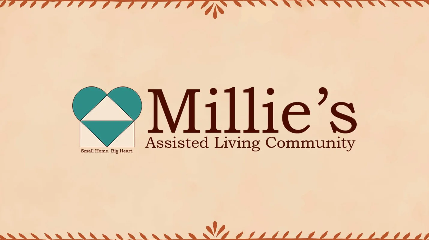
The logo was staying. They loved it, and rightly so: it's a heart and a house intersected, which is about as perfect a symbol as you could design for a place like this. What needed to change was everything around it. The old brown and yellow palette had aged past its time and was making the whole brand feel more dated than welcoming. The goal was a warm, Southwest-inspired palette that felt fresh and inviting while honoring the character of the building and the community it serves.
The Challenge
The palette needed to work for a very specific audience. Families researching care for a loved one are often carrying a lot (hope, worry, grief, love, all at once) and the colors needed to meet them gently. Too clinical and it would feel cold. Too cheerful and it would feel dismissive. Accessibility was also a real consideration throughout, with larger fonts and contrast ratios that genuinely work for an older audience.
The Result
A warm, Southwest-inspired palette of cream, teal, and rusty brown, chosen specifically to highlight the heart-and-house logo mark in a way the old colors never quite managed. The teal brings freshness and calm. The rusty brown grounds it with warmth and a nod to the adobe and stucco of the Southwest. The cream ties it all together softly, keeping everything feeling like home rather than a facility. The updated logo quality and color application gave the brand new life without touching a single thing the team already loved about it.
What Was Delivered
Logo color update and quality refresh
Colour palette with pairings
Approved color pairings list (WCAG compliant)
Font selection
Website
The Goal
The old website was basic and outdated, and it wasn't doing justice to what Millie's actually is. Families making decisions about care for a loved one need to feel something when they land on a page, not just read information. The goal was a site that felt as warm, personal, and genuinely home-like as walking through the front door. Accessibility was built in from the start, with larger fonts and clear structure throughout. A contact form and a downloadable waitlist PDF were practical priorities too.
The Challenge
Balancing the scrapbook aesthetic with the informational needs of the site was the central puzzle. This is still a website that families rely on to make serious, important decisions. It needed to feel warm and personal without ever sacrificing clarity or trustworthiness. Every decorative choice had to earn its place.
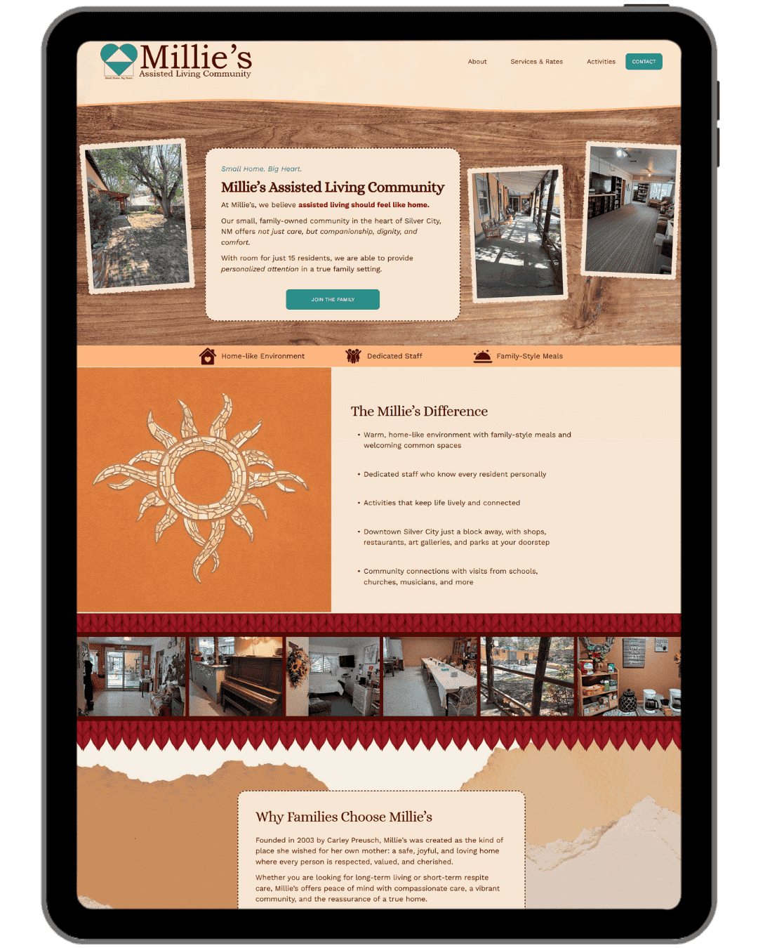
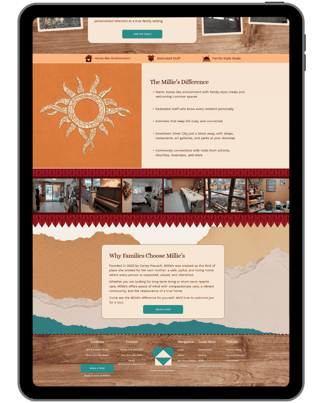
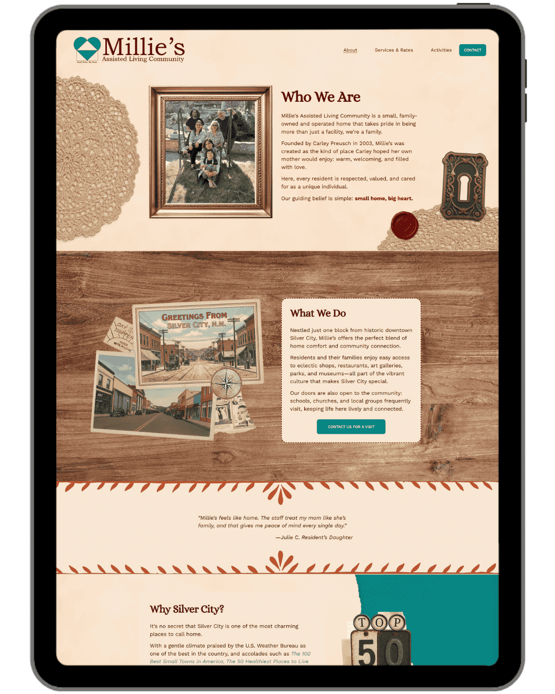
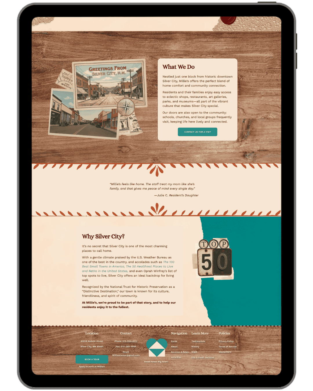
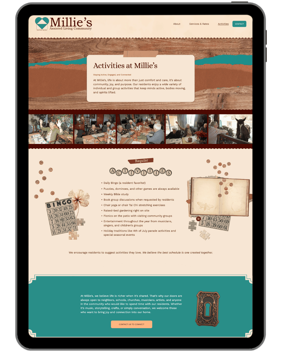
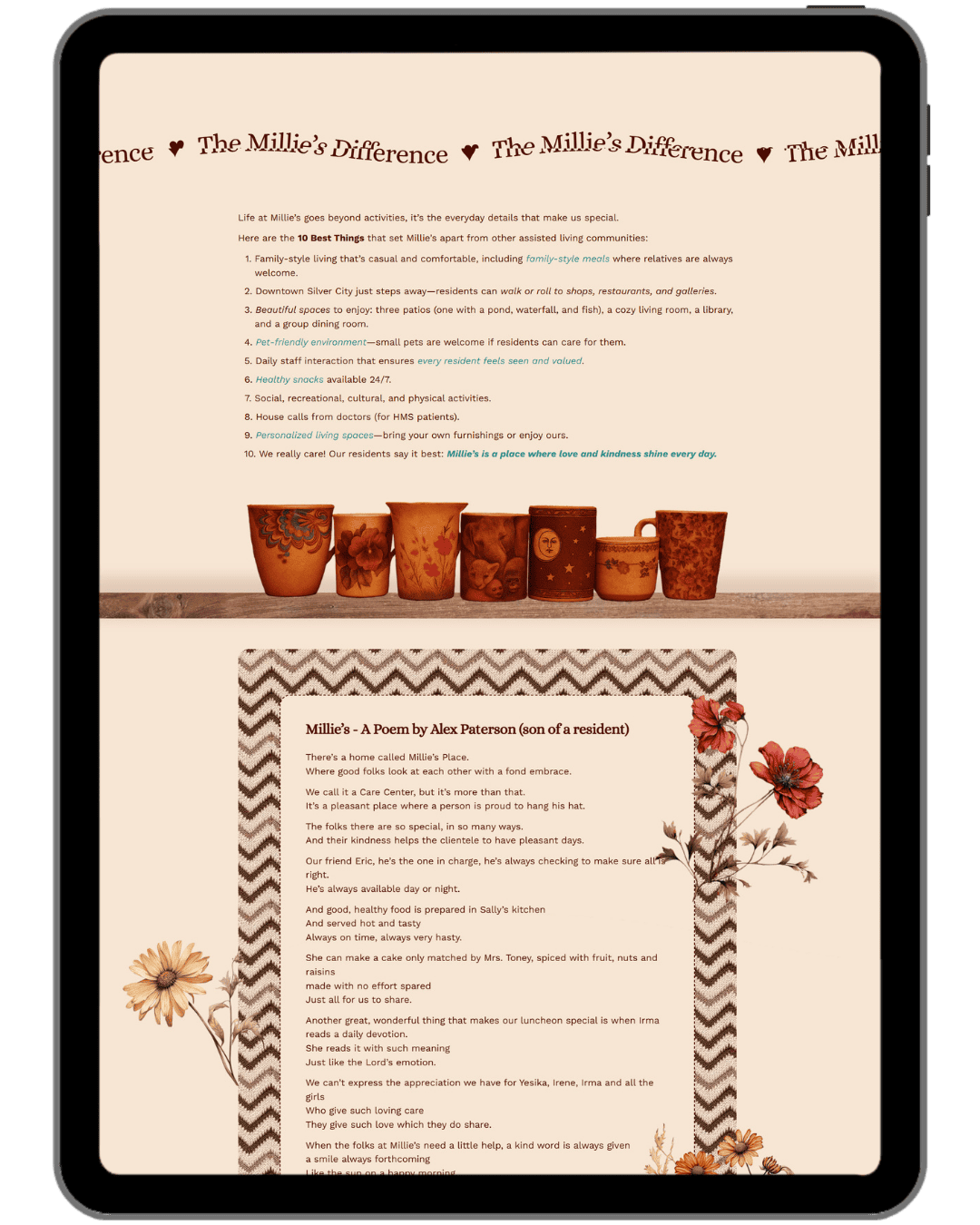
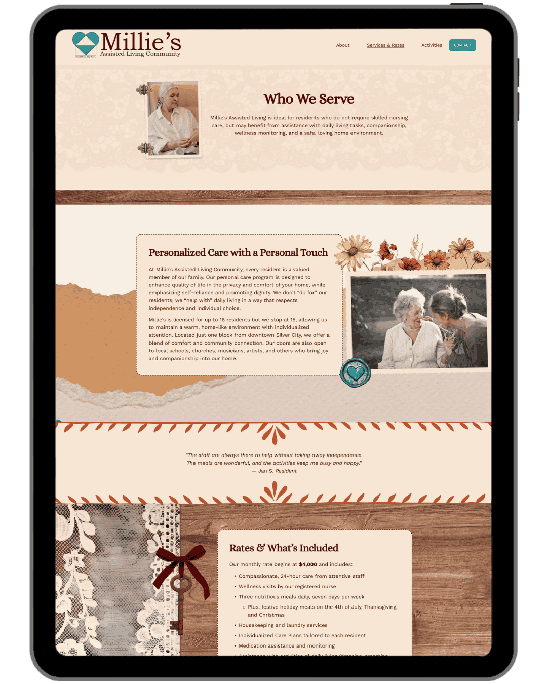
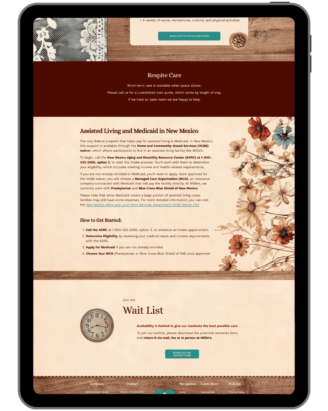
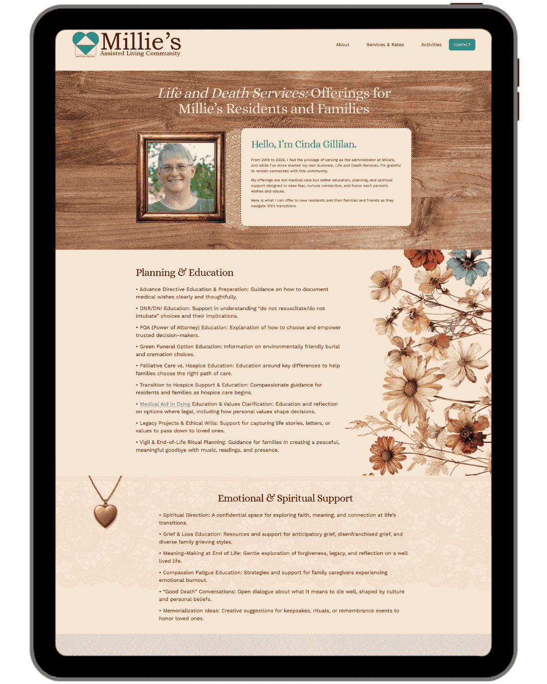
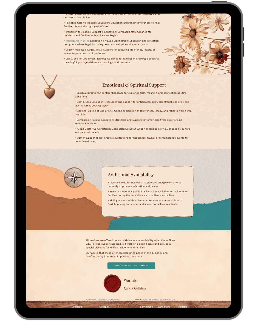
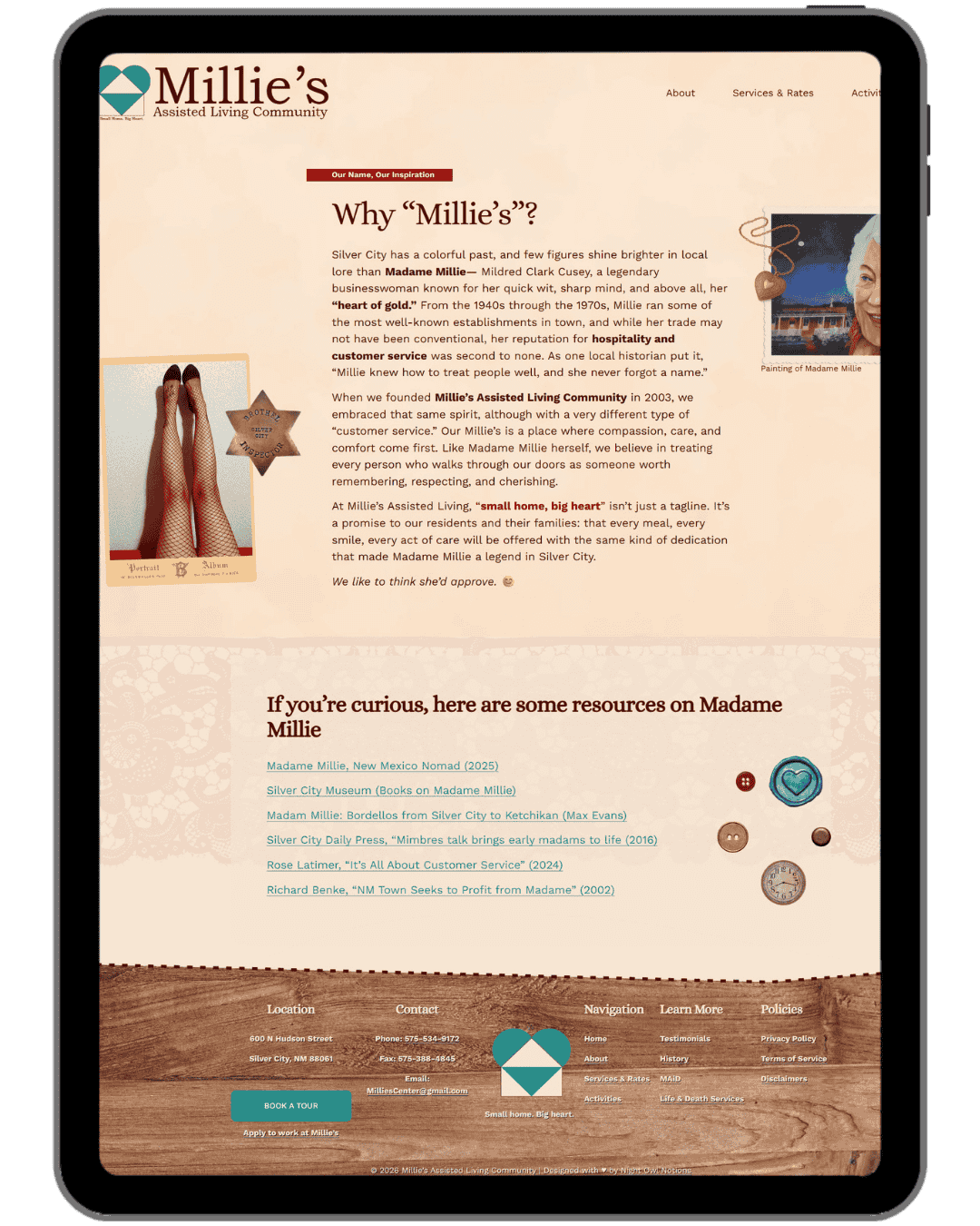
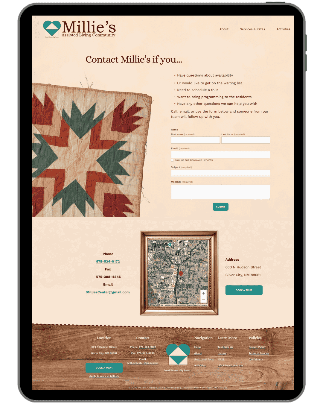
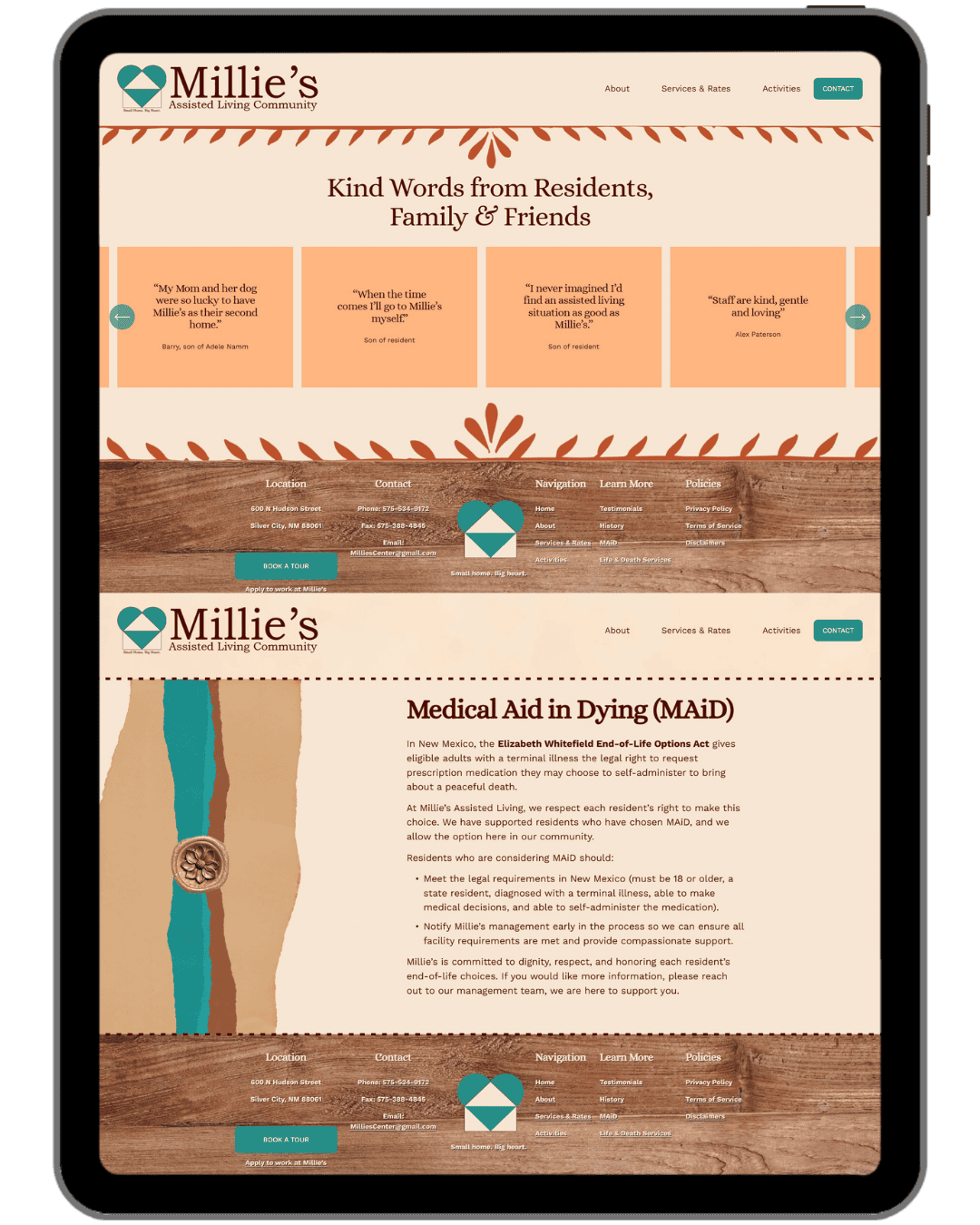
Website Screenshot Gallery
The Result
I treated this site like a digital scrapbook, which is an approach I hadn't seen done quite this way before (though it's since started trending in web design, which I'll take as a good sign!). Vintage cream paper textures, torn paper edges, wood grain backgrounds, knitted textures, and layered elements give every page a handmade, intimate feeling that perfectly mirrors the environment at Millie's itself. The design details go deeper than surface aesthetics too. The mosaic sun on the site was created to echo a real sun mosaic on the building's exterior. The stucco texture reflects what you'd actually see on a tour. Even the history of the building gets its own page, because a place named after Madam Millie deserves to own that story with pride.
The pages are clear, readable, and accessible throughout, with larger fonts and strong contrast. Families can find what they need quickly, feel the warmth of the place immediately, and take the next step with confidence.
What Was Delivered
Custom Squarespace website (migrated from WordPress)
Home, About, Services & Rates, Activities, and Contact pages
Testimonials, History, MAiD, and Life & Death Services pages
Sourced, generated, and custom-created design elements throughout (including a mosaic sun created to echo the building's exterior, stucco textures, vintage paper textures, torn paper edges, wood grain backgrounds, and knitted textures)
Contact form
Downloadable waitlist PDF link
Fully mobile-responsive design
Domain setup
Basic SEO (titles, descriptions, image alt text, page structure)
Website strategy session
Website content support (guidance and editing)
Built-in guidebook
Launch training walkthrough
Kind Words from The Client
"She doesn't just build websites — she creates an experience that is thoughtful, organized, and empowering from start to finish. Her ability to listen deeply, translate vision into design, and guide clients through the process with clarity and care is truly exceptional."
— Cinda Gillilan, on behalf of Millie's Assisted Living Community
Graphic Design
The Goal
Matching print materials to the refreshed brand, so Millie's had something polished and cohesive to hand to families during tours or conversations..
The Challenge
The materials needed to feel just as warm and home-like as the website, while still being professional enough for a care facility presenting itself to families making important decisions.
The Result
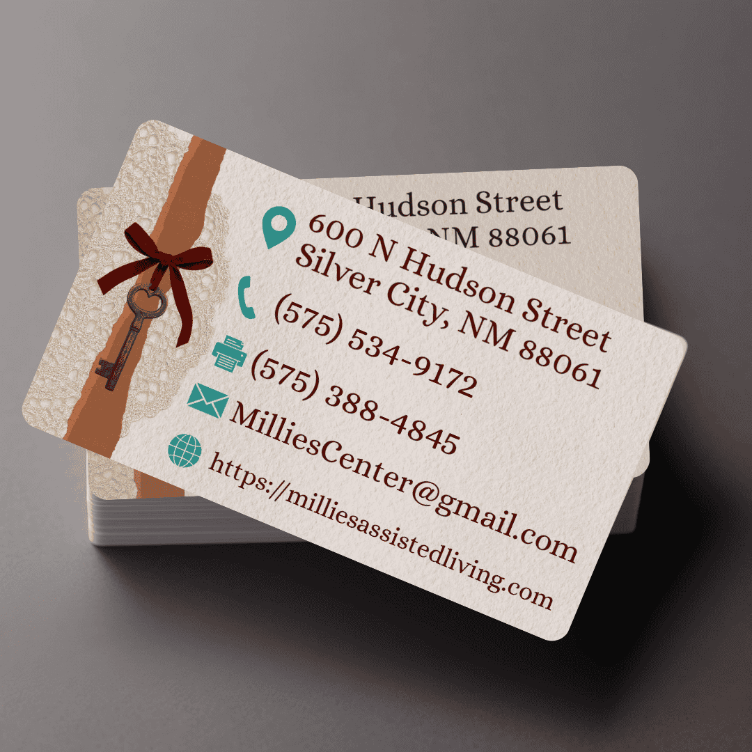
A business card and letterhead set that carry the same Southwest warmth and approachability as the site. The letterhead in Google Doc format means the team can write on it themselves without any design knowledge required.
What Was Delivered
Business card design (print-ready)
Letterhead design, delivered as both a print-ready PDF and an editable Google Doc
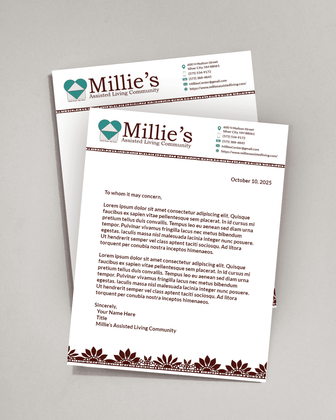
Letterhead
Business Cards
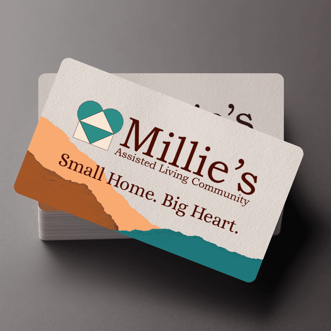
Front
Back