Hairsine Community League
Brand Design, Web Design, & Graphic Design

Project Overview
This one is personal. Hairsine Community League was the project that made me realize web design wasn't just something I did for fun occasionally. It was something I wanted to do on purpose, for businesses and organizations that actually matter to people. Doing work with real community impact lit something up that I hadn't felt before, and honestly, Night Owl Notions exists in part because of what this project showed me about myself.
Hairsine Community League has been bringing neighbors together across four Edmonton neighborhoods since 1980. Events, resources, connection, community. All the good stuff. But their branding was inconsistent and outdated, their website hadn't seen a meaningful update since 2014, and neither was doing justice to the heart of what the league actually does. They needed a refresh that honored 40+ years of history while giving the community something they could actually be proud to point people toward.
Project at a Glance
| Client | Hairsine Community League |
| Industry | Community Organization, Nonprofit |
| Services Provided | Website Design, Branding, Graphic Design |
| Platform | Squarespace (migrated from WordPress) |
| Location | Edmonton, AB |
| Live Site | hairsine.ca |
Branding
Primary Horizontal Logo
Logo Varients
Palette
Graphics
The Goal
Build a warm, welcoming brand identity that honored the league's history while bringing it into the present. Something the community would recognize and something new members would feel immediately welcomed by.
The Challenge
The previous branding was all over the place. Inconsistent colors, pixelated logos, no cohesive identity to speak of. The new brand needed to feel modern without abandoning what was familiar, and it needed to be practical too. Board members would be using these assets across all kinds of programs and platforms, so the fonts and elements had to be accessible without requiring anyone to install custom typefaces or have a design background to use them consistently.
The Result
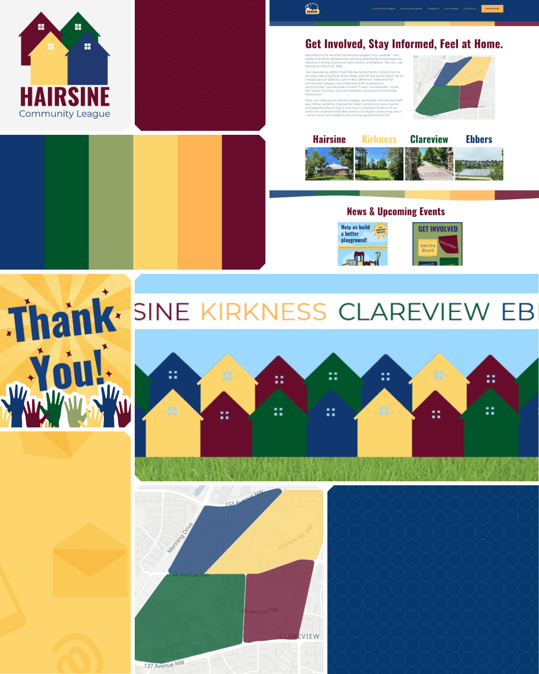
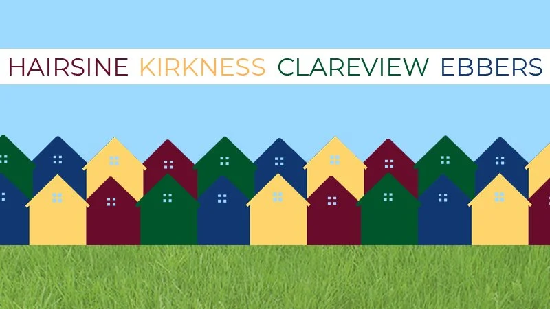
The updated palette kept the league's historical burgundy and blue (those colors meant something and deserved to stay) while bringing in new complementary tones to freshen everything up. The new logo evolved thoughtfully from previous versions, featuring the hawk (a longtime symbol of both the league and its soccer team) alongside house icons representing each of the four neighborhoods the league serves. Typography was chosen specifically for real-world usability: classic, widely accessible fonts that any board member can use consistently across any program, no installation required. The brand feels like the league: familiar, warm, and built to last.
What Was Delivered
Logo design (evolved from previous versions)
Logo variations
6 custom patterns
At-a-Glance Brand Guide
Updated colour palette with complementary tones
Font selection (accessibility and usability focused)
Brand guidelines
Website
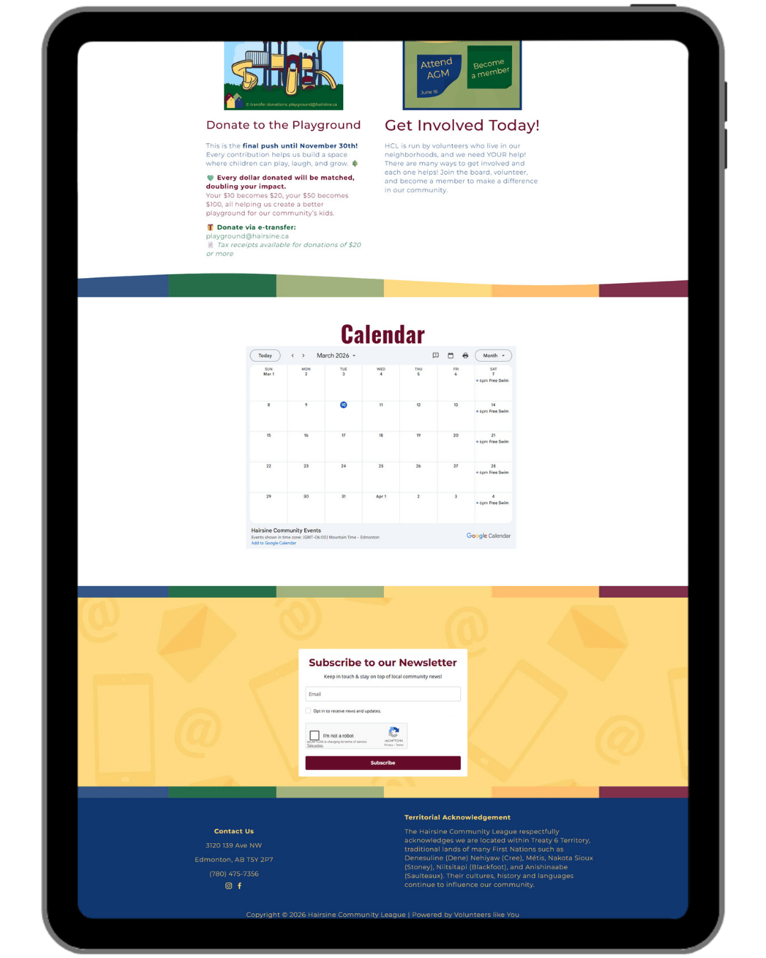
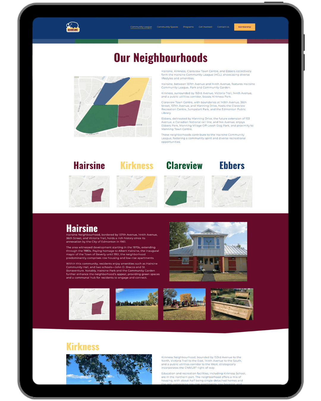
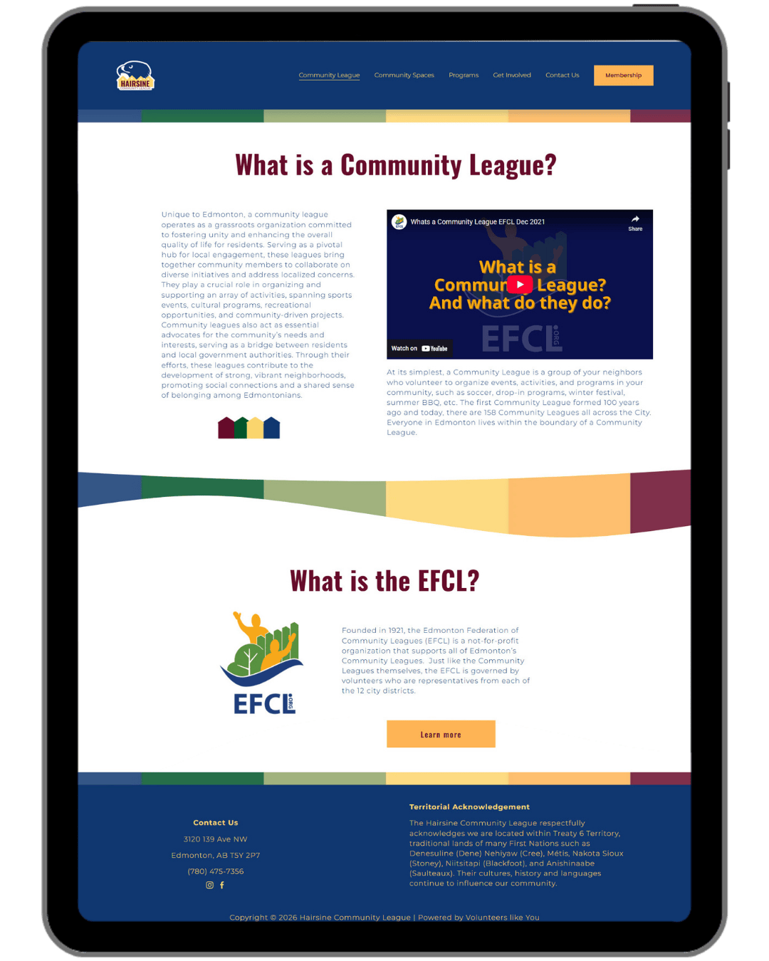
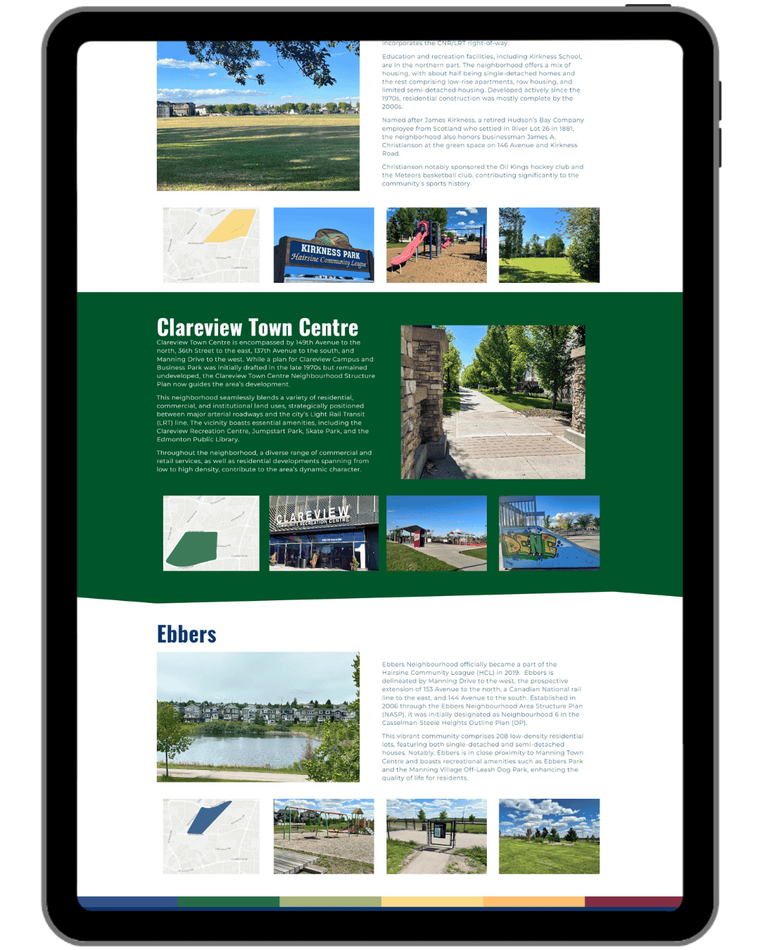
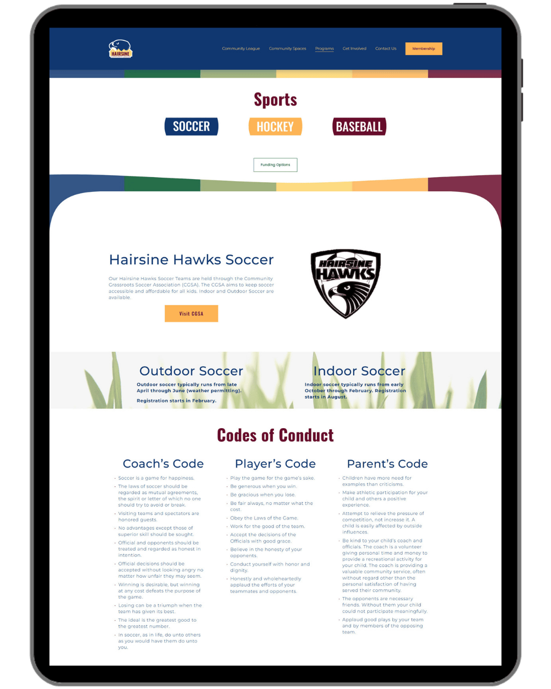
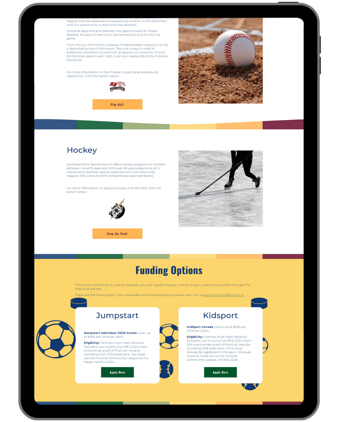
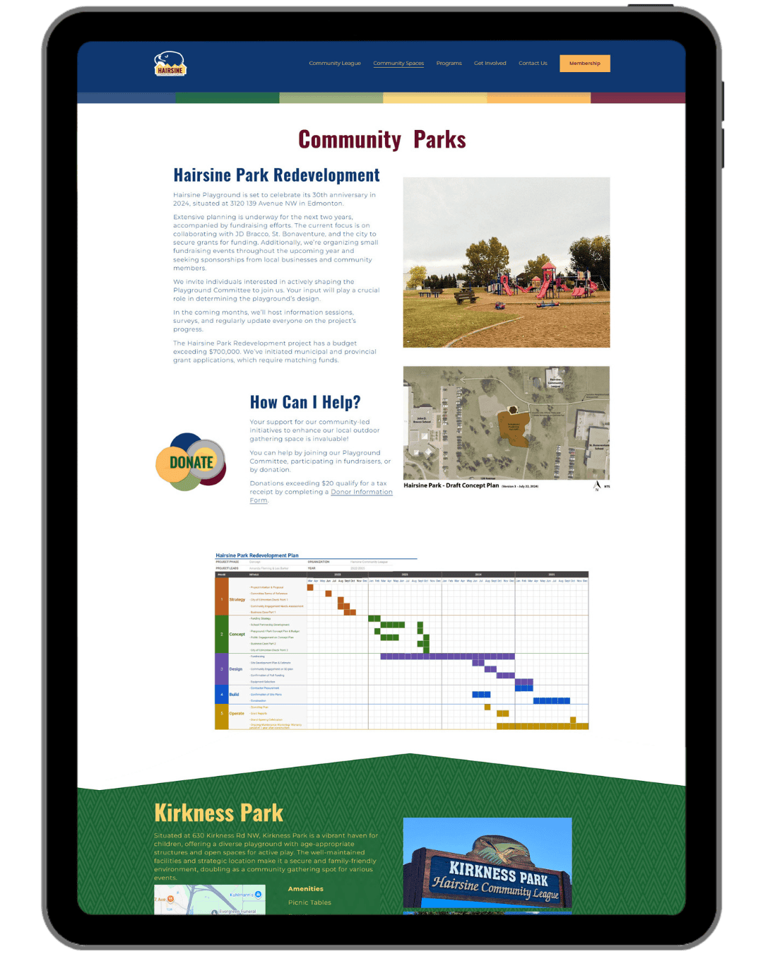
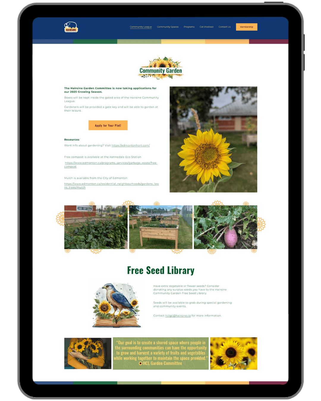
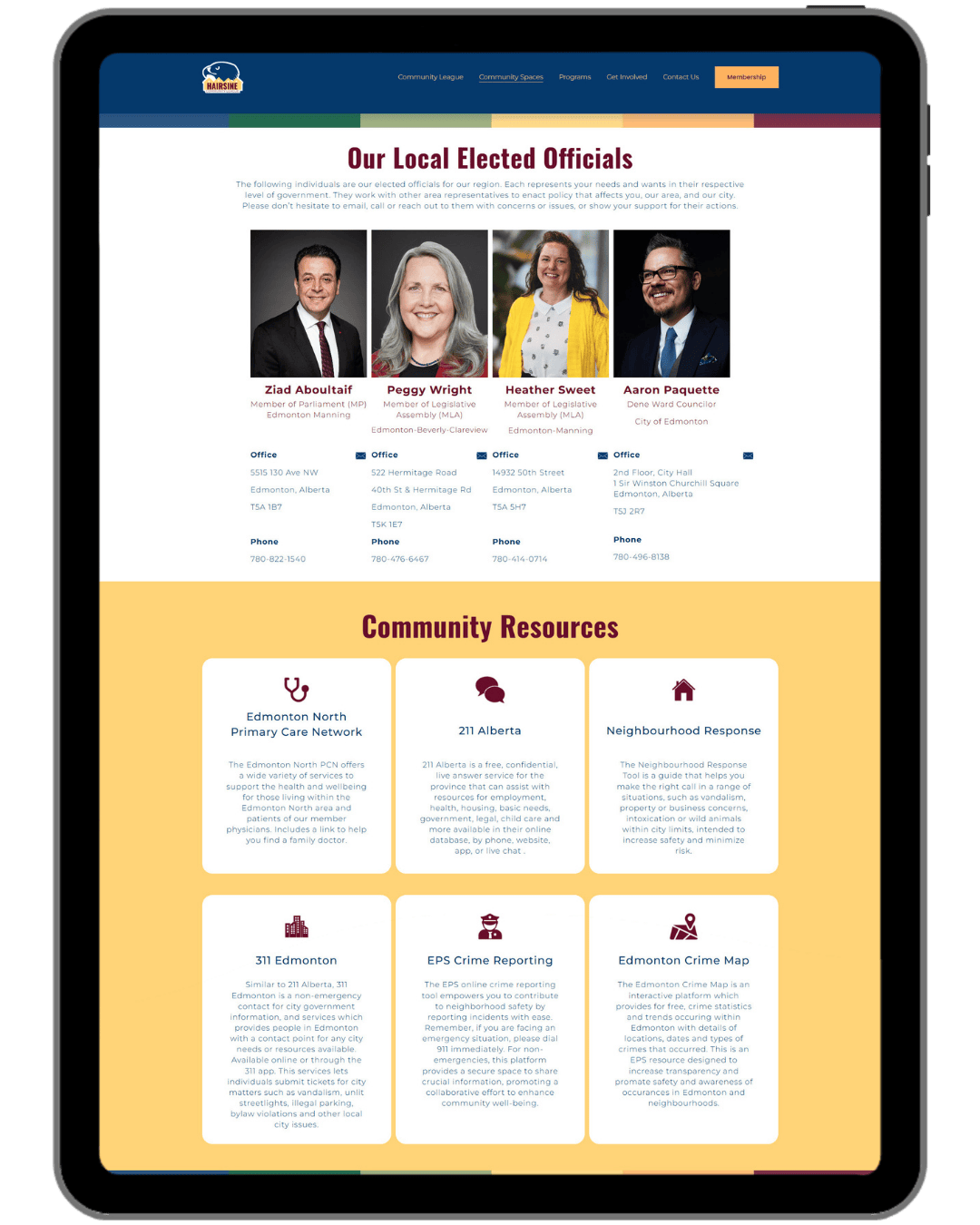
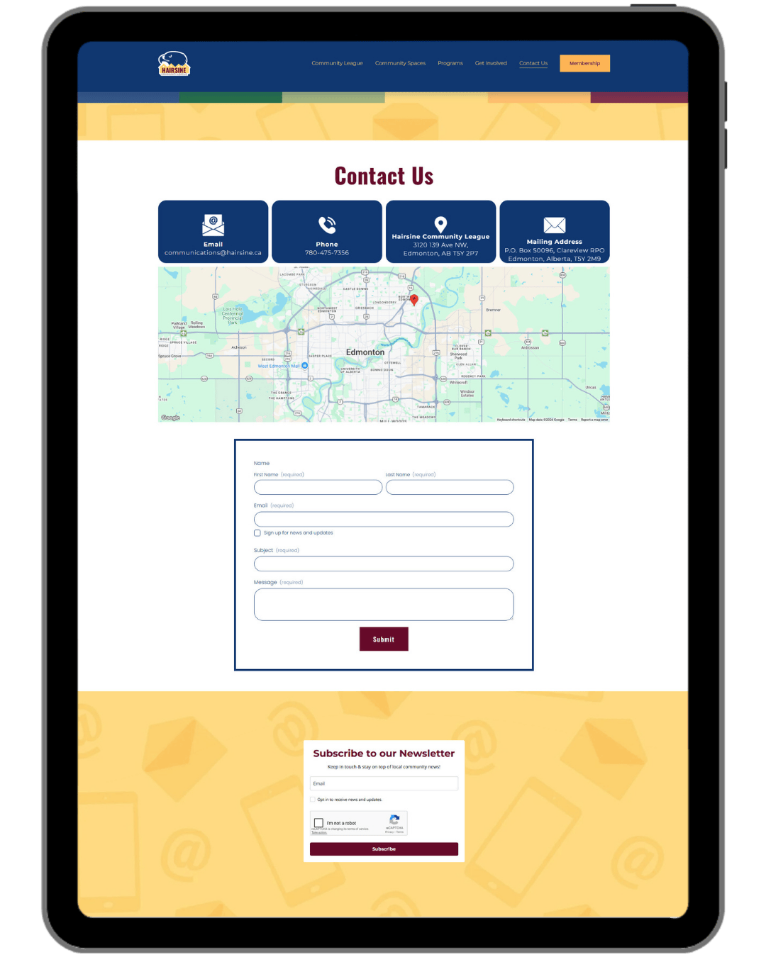
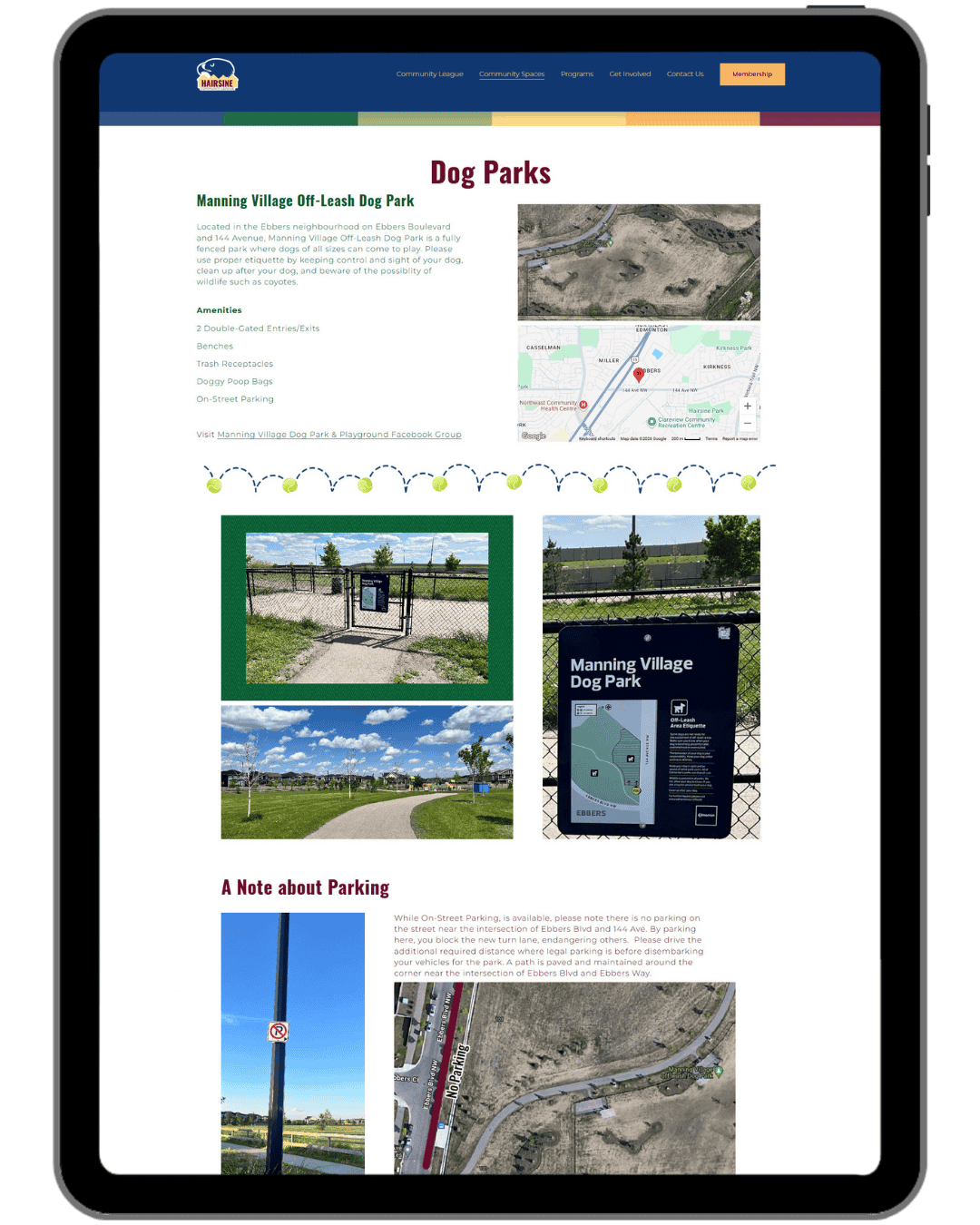
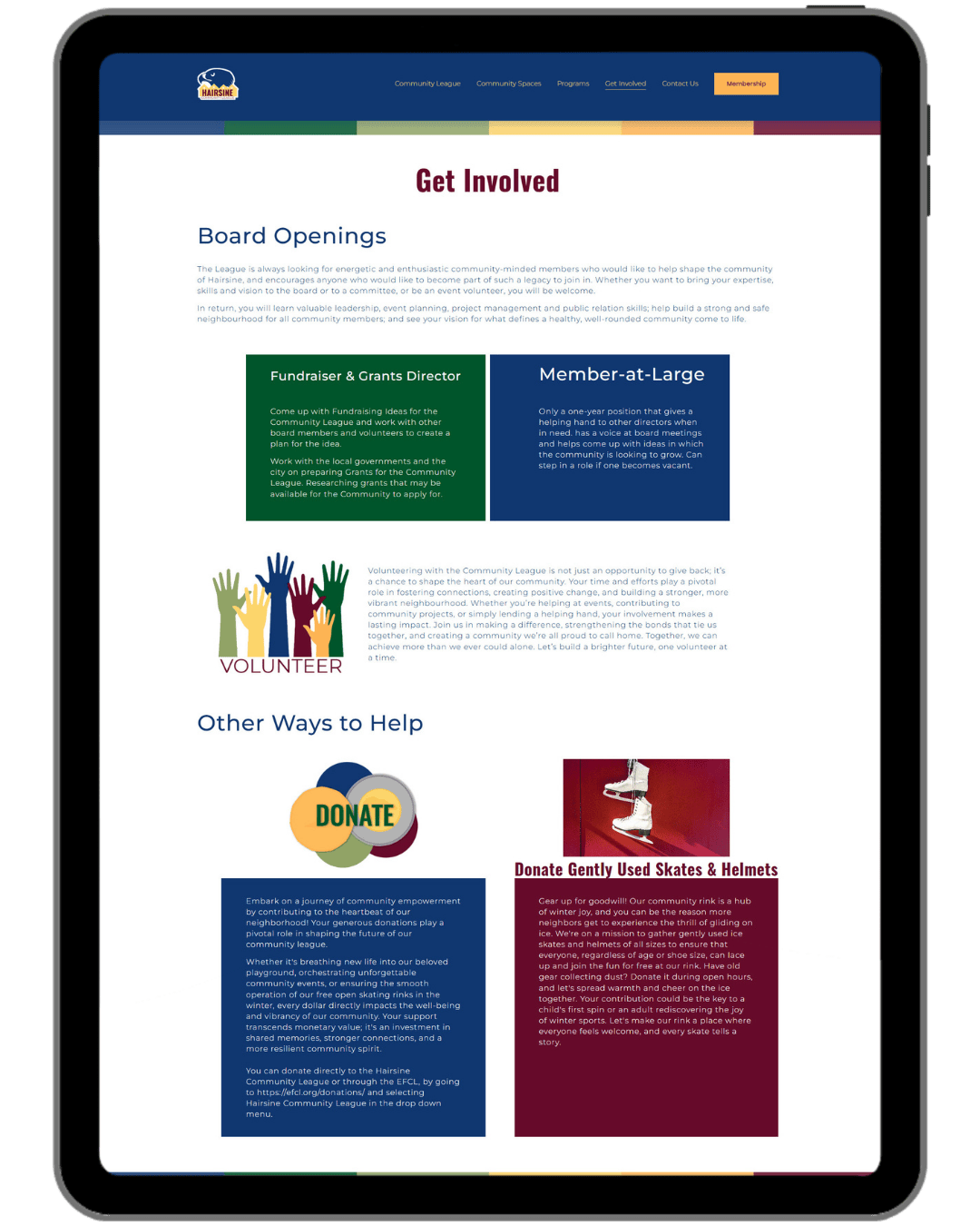
Website Screenshot Gallery
The Goal
A website the community could actually use and the board could actually maintain. Community news, events, and memberships needed to be easy to find, easy to update, and easy to navigate for members of all ages and tech comfort levels.
The Challenge
The old WordPress site was a maintenance nightmare. Outdated plugins, a complex backend, and minimal updates since 2014 meant the information was stale and the experience was frustrating. And then it got hacked and hijacked entirely, which was the moment it became very clear that a platform change wasn't just a nice idea, it was necessary. The new site needed to be secure, simple for a volunteer board to maintain without ongoing technical support, and built to actually stay that way.
The Result
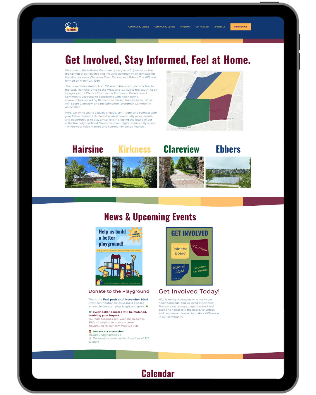
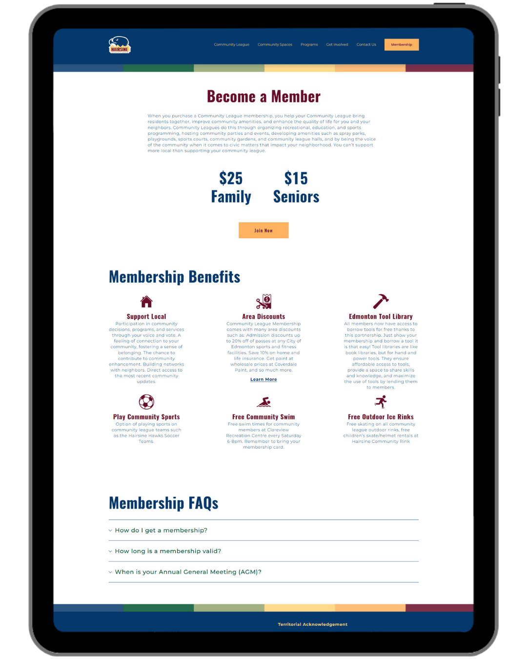
Moving to Squarespace was a game changer for the board. What used to require a developer or a very patient volunteer now takes a few clicks, and the security headaches that came with WordPress are gone entirely. The redesigned site features clear navigation, an integrated events calendar, and all the community information members actually need, wrapped in the warm, welcoming design of the refreshed brand. The community's response was genuinely lovely. Members, neighboring community organizations, and people across the area noticed, appreciated it, and said so.
What Was Delivered
Custom Squarespace website (migrated from hacked WordPress site)
21 pages total (including custom 404)
Integrated events calendar
Newsletter signup
Membership page
Fully mobile-responsive design
Domain setup
Basic SEO (titles, descriptions, image alt text, page structure)
Favicon
Website strategy session
Website content support (guidance and editing)
Built-in guidebook
Launch training walkthrough
Graphic Design
The Goal
A community league site with 21 pages and a whole calendar of ongoing events needs a lot of visual support. The goal was to build out a full suite of graphics that gave the league a consistent, recognizable visual presence across the site and on social media.
The Challenge
The sheer volume and variety of what was needed. From functional site graphics to event-specific posts to reusable social media templates, every piece needed to feel cohesive with the refreshed brand while being practical and flexible enough for a volunteer board to actually use ongoing.
The Result
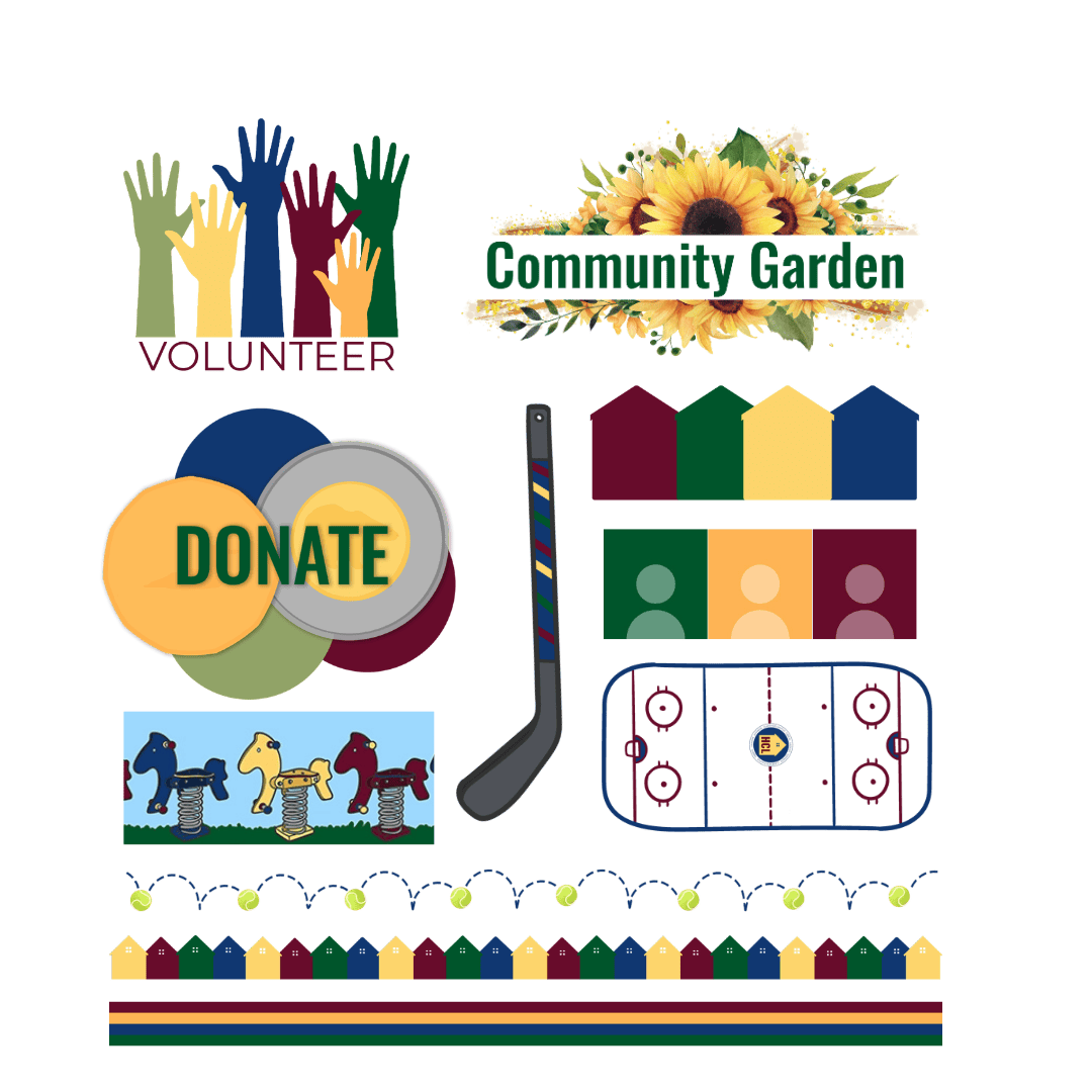
A comprehensive library of graphics covering just about everything the league needed. The colorized neighborhood map gives the site an immediately distinctive and community-rooted visual anchor. Event graphics, donation graphics, social media templates, and stickers round out a suite that gives the board everything they need to show up consistently, online and beyond.
What Was Delivered
Custom colorized neighborhood map
Event graphics
Donation graphics (including coin graphic)
Social media templates
Letterhead
Event post graphics
Stickers
Social Media Graphics