
Clareview Skateboard Skillsfest
One Page Website & Graphic Designs

Project Overview
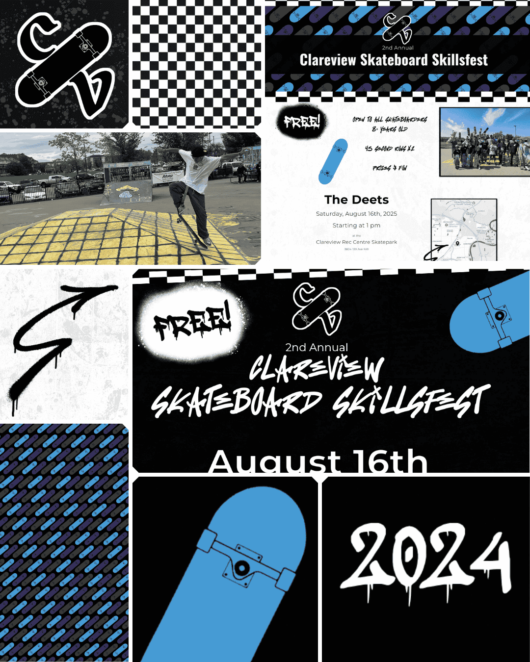
Not every project fits neatly into a box, and this one is proof that good design shows up everywhere, including a skateboard park in Edmonton. Clareview Skateboard Skillsfest is an annual one-day community event, and starting in 2025 it got a proper digital home to match the energy of the event itself.
Before that it was graphics only, which meant 2025 was the first time the full promotional package came together: a one-page website, flyers, and a suite of graphics, all built around a grunge, graffiti, and punk aesthetic that feels right at home at a skatepark.
Project at a Glance
| Client | Clareview Skateboard Skillsfest |
| Industry | Community Event |
| Services Provided | One-Page Website, Graphic Design |
| Platform | Squarespace |
| Location | Edmonton, AB |
| Live Site | Available on request |
Website
The Result
The design takes its lead from the event logo (brought in by another collaborator on the project) and runs with it: checkered patterns, graffiti and spray paint elements, and a grunge aesthetic that feels completely at home in a skatepark. Registration is handled through an integrated Google Form so the organizing team can all access submissions in one place without any technical fuss. Squarespace's built-in page QR code lives on all the printed flyers, making it genuinely effortless to get people from a piece of paper straight to the registration page.
The first year was a success, so the event became annual and the website came with it. With a full year of real event photography already in hand, the promotional materials for year two had something stock photos never could offer: the actual faces, energy, and moments from the event itself.
What Was Delivered
Custom one-page Squarespace website
Google Form registration integration
Fully mobile-responsive design
Basic SEO (titles, descriptions, image alt text, page structure)
The Goal
A single page that did everything the event needed: inform, promote, and register. Attendees needed to be able to find out what the event was, when and where it was happening, and sign up, all without clicking away or getting lost. Simple, punchy, and easy to share.
The Challenge
Packing all the essential event information plus a registration flow into a single page without it feeling cluttered or overwhelming took real structural thought. Every section had to earn its place. The design also needed to feel like a skateboard event, not a community newsletter. Grunge, energy, and personality were non-negotiable, while still being clear and functional enough to actually drive registrations.
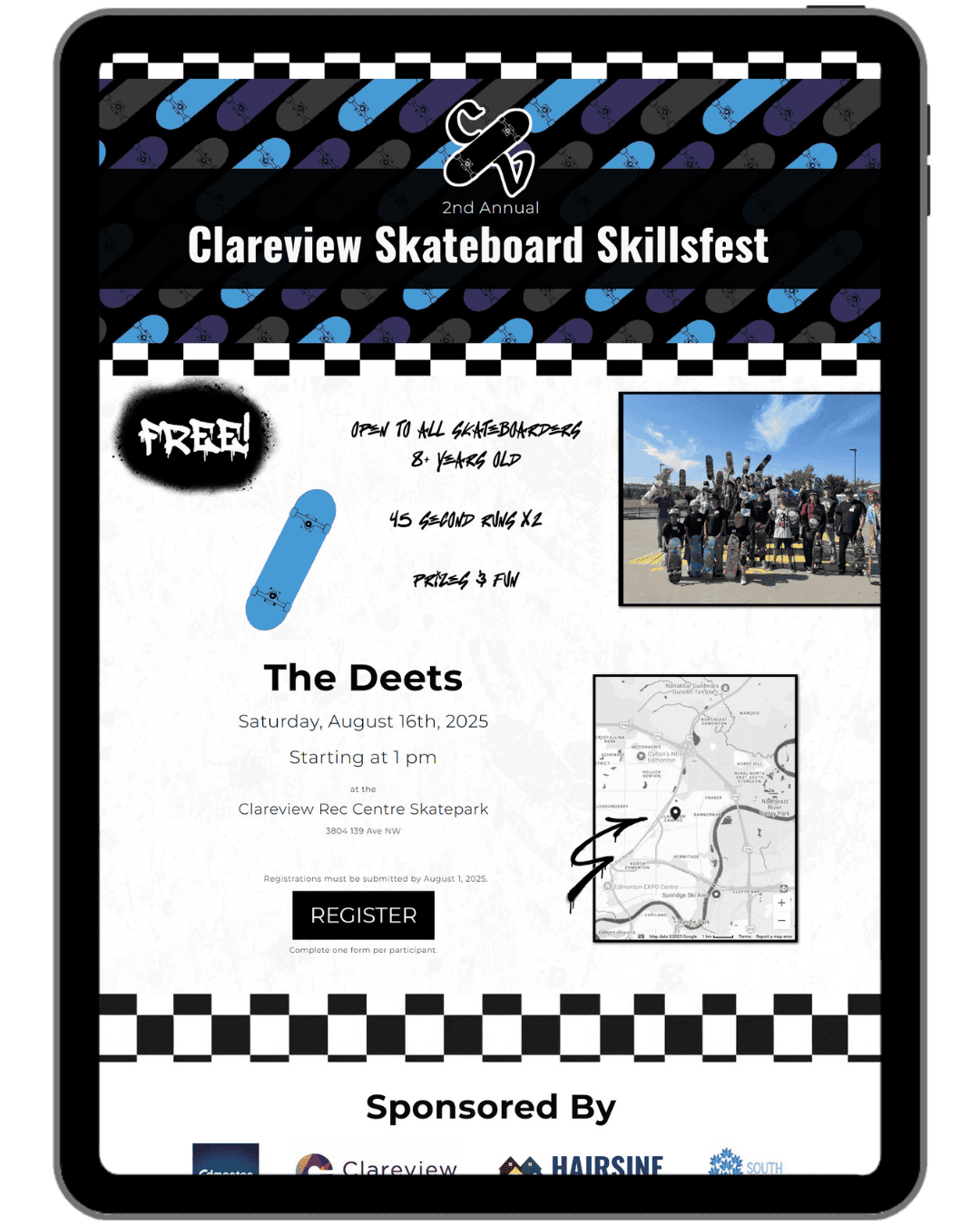
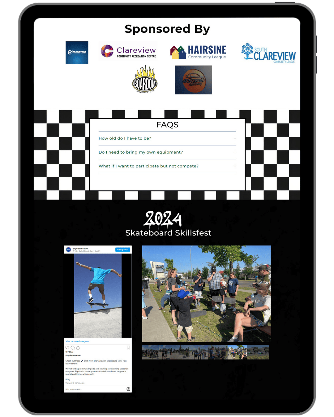
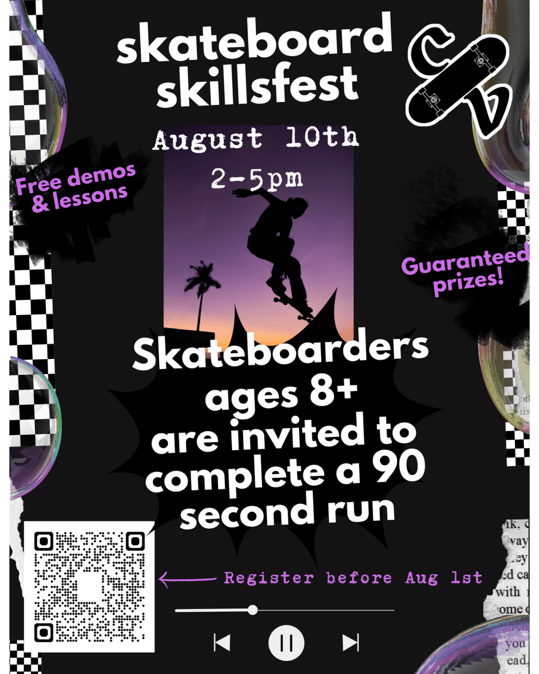
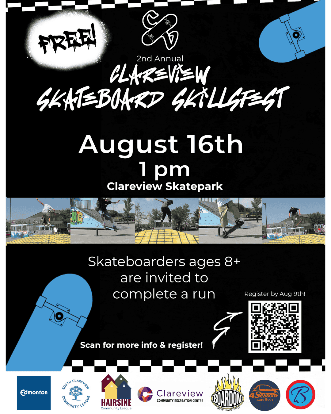
Website Screenshot & Poster Gallery
Graphic Design
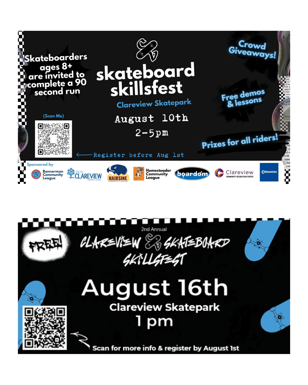
Electronic Billboard Graphics
The Goal
A full promotional package that could get the word out about the event across print and social media, cohesive with the website and built to actually be used in the real world, including in the neighborhood where the event takes place.
The Challenge
Every year the design needs to walk a line between familiar and fresh. Returning attendees should recognize it immediately. New ones should feel the energy right away. Keeping the grunge and skate aesthetic consistent as the anchor while finding new ways to make each year feel distinct is an ongoing and genuinely fun creative puzzle.
The Result
A suite of promotional graphics that bring the same energy as the website into the physical world. The flyers tie directly to the site via QR code, the social media graphics carry the aesthetic across digital channels, and the electric pylon graphic near the park puts the event right in front of the community it serves. Year one used stock photography. Year two brought in real photos from the inaugural event, which added a whole new layer of authenticity and excitement to the promotional materials.
What Was Delivered
Event flyers (with QR code linking to registration page)
Social media graphics
Electric pylon graphic